
Do you remember autumn from your childhood, when the leaves changed color like a kaleidoscope, and your mom would pull out the pumpkin-colored sweater she'd worn since college? Or those evenings in front of the TV while a storm raged outside, and the lamplight in the house gave everything a warm, amber hue? Those were the days when no one talked about "color palettes" or "color stories"—colors simply existed, as natural as breathing. Today, when we can choose from 50 shades of gray (and no, I'm not talking about THAT book), we sometimes lose track of what truly makes a home feel cozy. At Pillovely, we believe that autumn colors aren't a trend—they're a return to what makes us feel safe. Because "You are someone"—someone who deserves a space filled with colors that snuggle like a grandma's blanket.
The Psychology of Autumn Colors – Why They Act as Therapy
Autumn's colors are no accident of nature. They're millions of years of evolution (as they say in National Geographic) that have taught us to associate warm colors with safety, a hearth, and shelter from winter. Our brains see brown and think: stability. They see orange and feel: warmth. They see burgundy and know: coziness.
It's like a soundtrack to a movie – the right colors create the mood. Autumnal shades lower blood pressure, slow the pulse, and tell our nervous system, "Relax, you're home." In times when stress is our middle name and burnout lurks around the corner, surrounding ourselves with calming colors isn't a whim – it's mental hygiene.
Trends 2025 – autumn colors that rule
Cinnamon Spice – cinnamon is on trend
Pantone announced it, designers loved it, and IKEA released the entire collection. Cinnamon is the new black. But not the bright, bland kind – deep, saturated, like the spice in mulled wine. It's a color that:
-
Goes with everything (seriously, check it out)
-
It warms up even the most sterile interior.
-
It looks expensive, even in the Pepco version
Where to use: Pillows, blankets, a single accent wall. Don't overdo it – too much cinnamon is like too much cinnamon in apple pie.
Sage Green – sage that calms
Green, but not a "spring meadow" kind. Sage is a green that's undergone therapy – calm, balanced, mature. Like Meryl Streep among colors – elegant in every role.
It goes perfectly with:
-
White (classic)
-
Beige (calm²)
-
Terracotta (for the brave)
Where: Bedroom (spa-like sleep), bathroom (zen vibes), kitchen (freshness without the screaming).
Warm Terra – the earth that warms
Terracotta had its 5 minutes of fame in the '90s (remember those flowerpots?). Now it's back as Warm Terra—more refined, less flashy. It's like Pokémon evolution—same essence, higher level.
Shades:
-
Rust (rust but glamour)
-
Clay (clay but chic)
-
Brick (brick, but soft)
Deep Plum – plum for adults
Was purple associated with Prince and the '80s? Forget it. Deep Plum is a purple that has matured—deep, mysterious, sophisticated. Like wine that has been aged long enough.
Note: Use sparingly. It's like perfume – a drop makes all the difference, a bottle is overkill.
Golden Hour – gold without kitsch
It's not about Trump-style gold. Golden Hour is a warm, honey-toned shade, like the light at sunset. Subtle yet transformative. It adds luxury without screaming, "Look, I've got money."
Where it works wonders:
-
Details (frames, handles, candlesticks)
-
Fabrics (curtains in this color = instant elegance)
-
Lighting (bulbs at this temperature)
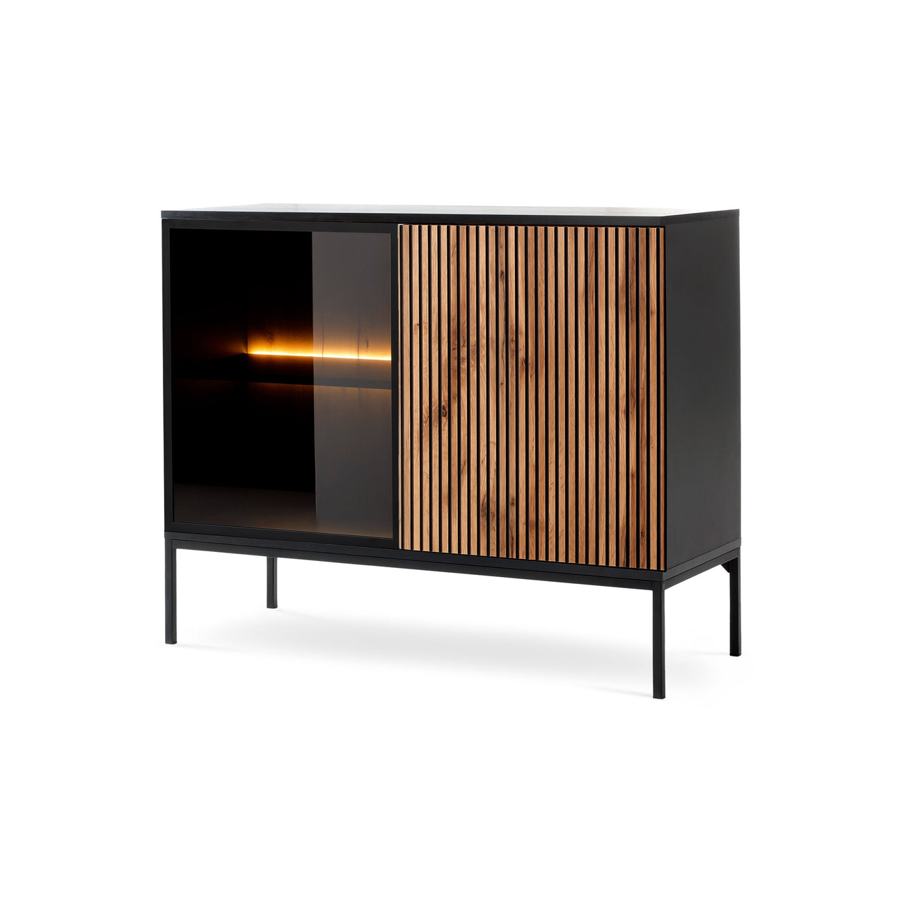
Chocolate Brown – Chocolate is back
Was brown passé? Not anymore. But not the brown of 2000s "youth" furniture. Chocolate Brown is a Milka ad-worthy brown—it makes you want to bite. Deep, saturated, comfort food in color.

How to Introduce Fall Colors – A Stress-Free Guide
The 60-30-10 Rule – The Holy Trinity of Colors
60% dominant color (neutral – beige, gray, white) 30% supporting color (this is where autumn shades come in) 10% accent (strong color for character)
It's like putting together an outfit – the trousers and jacket are calm, the shirt adds character, the tie makes the show.
Start small – baby steps
You don't have to paint your entire house cinnamon at once. Start by:
-
Pillowcases (cheapest makeover ever)
-
Blanket for the couch (instant fall)
-
Vases, candlesticks (details that make the difference)
-
Paintings, posters (art in autumn colors)
One wall – maximum effect, minimum effort
An accent wall in autumn color is like a statement necklace – one element that changes everything. Which wall?
-
Behind the Couch (Classic)
-
In the bedroom behind the bed (maximum coziness)
-
In the dining room (appetizing background)
Pro tip: Washable wallpaper = you can change your mind without renovating.
Combining Colors – How to Avoid Fall Kitsch
Monochrome combinations
Different shades of the same color. Beige + caramel + chocolate = sophistication. It's like tonal dressing, only for the home.
Complementary contrasts
Sage + terracotta = wow. Plum + gold = elegance. Cinnamon + pomegranate = unconventional, but it works. It's like food pairing – sometimes the oddest combinations taste the best.
Neutral base
White, gray, and beige as the base. Autumnal colors as accessories. You can't overdo it when the base is calm. It's like a little black dress—anything goes with it.
Materials and textures – autumn is not just about color
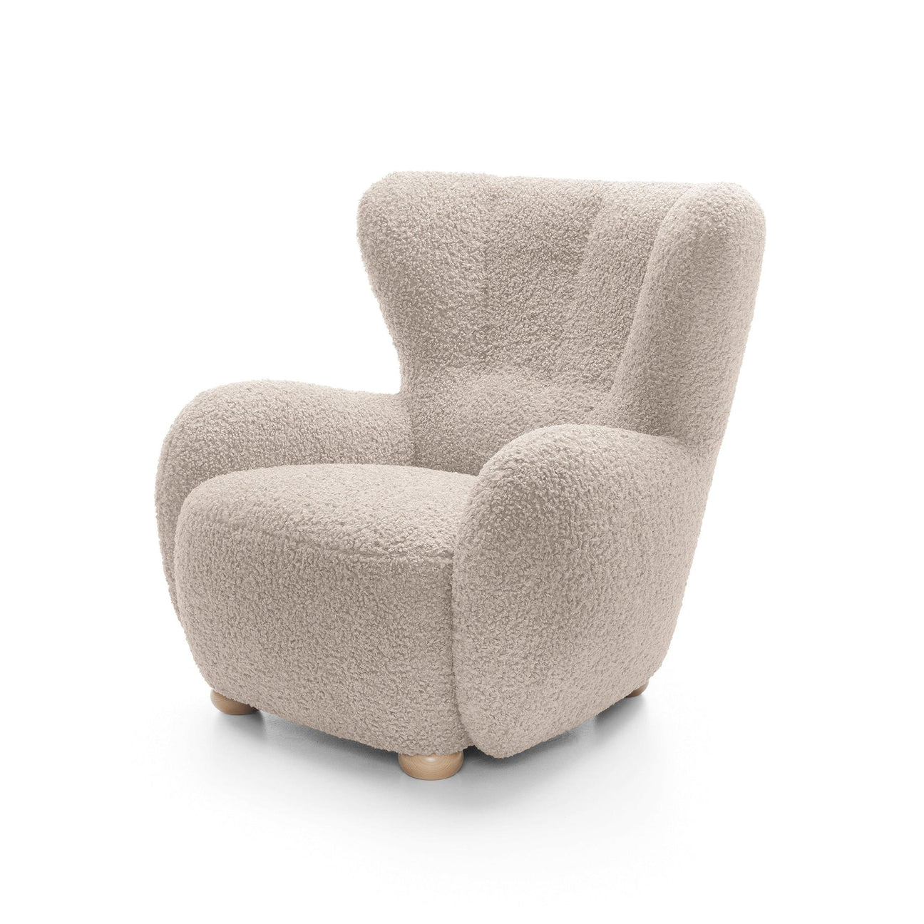
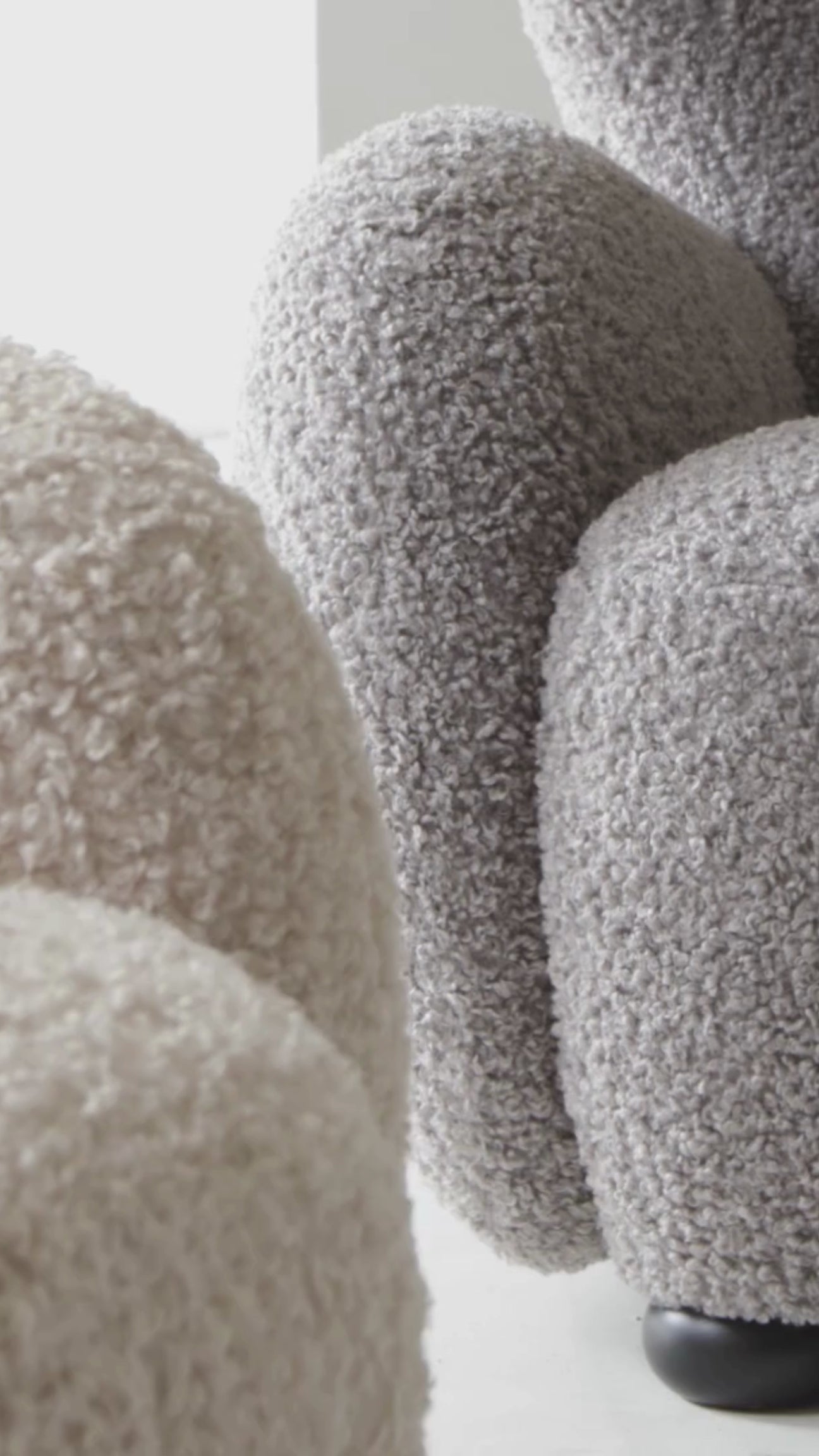
Velvet and velvet – the soft side of autumn
Velvet cushions in autumnal colors are like double espresso – double the effect. Color + texture = autumn at its best.
Wool and knitwear – sweater weather for the home
Chunky knit blankets and knitted pillows. They don't just look autumnal—they feel autumnal. A multisensory experience, like 4DX in a movie theater.
Wood and rattan – nature inside
Natural materials in warm shades. Wooden bowls, rattan baskets. Like Las Vegas – what happens in nature, stays in your home.
Metal in warm shades
Copper, brass, antique gold. Cool metal + warm tone = balance. Like fire and ice in "Game of Thrones" – opposites that create harmony.

Lighting – How to Highlight Autumn Colors
Color temperature matters
2700K-3000K – these are your friends. Warm light highlights autumn colors. Cool light (4000K+) kills all the magic. It's like an Instagram filter – choose wisely.
Candles – old school but gold
Candlelight is autumn colors' best friend. The flicker adds life, and the warm hue highlights the colors. Plus, the scent (pumpkin spice, anyone?).
Garlands and lights
Not just for the holidays. Warm LEDs create an instant autumnal atmosphere. Like a cheat code in a game, they instantly level up the atmosphere.
Room by room – what fits where
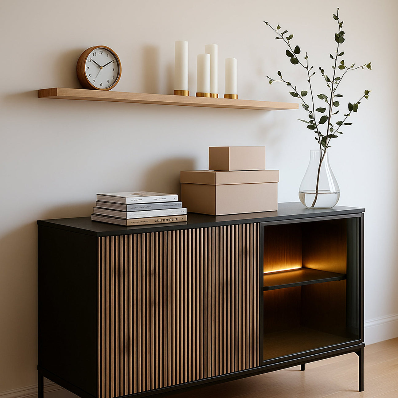
Living room – the heart of autumn
Here, you can let your hair down. Cinnamonpillows , a terracotta blanket, gold details. The living room is the stage, autumn colors the costumes.
Bedroom – calm shades
Sage, light warm terra, and delicate browns. This is about sleep, not show. Like a lullaby, it's meant to soothe, not excite.
Kitchen – appetizing colors
Terracotta, cinnamon, warm yellows. Colors that awaken the appetite. But on the walls, not on entire pieces of furniture (unless you like living on the edge).
Bathroom - spa in autumn colors
Sage + wood + white accents = instant zen. Add candles and plants. Your own spa without leaving home.
Hallway – first impression
One bold accent—perhaps autumn-patterned wallpaper? Or a copper-colored framed gallery wall? First impressions matter.

Mistakes to avoid – autumn don'ts
Overdoing it with one color
An entire apartment in pumpkin color? This isn't autumn, this is Halloween horror. Balance, people, balance.
Ignoring natural light
North windows + dark colors = depression. Check how the color looks in different lighting. It's like casting – you have to see it in different scenes.
Forgetting about neutrals
Autumn colors without a neutral backdrop are like a non-stop concert – tiring. Give it some time.
Seasonal madness
Fall colors can last all year long. It's not a Christmas tree—you don't have to put it away in January.
DIY – autumn makeovers for pennies
Fabric dyeing
Old pillowcases + fabric dye = new life in autumn colors. Like Pokemon Evolution, only cheaper.
Painting flower pots
Terracotta spray for regular flowerpots. Instant autumn collection. Pinterest level achieved.
Branches and leaves
Branches with colorful leaves in a vase. Free decoration courtesy of Mother Nature.

Budget for autumn makeovers
0-100 PLN
-
Pillowcases
-
Candles in autumn colors
-
DIY decorations
100-500 PLN
-
Statement blanket/plaid
-
Curtains in a new color
-
Several decorations (vases, frames)
500+ PLN
-
Painting the wall
-
New armchair in autumn color
-
Wallpaper for one wall
Summary – the autumn that stays
Autumn colors in the home aren't a passing TikTok trend. They're a return to what's natural, what warms, what makes your home smell (metaphorically) like Grandma's apple pie. In a world where everything is fast, instant, and disposable, surrounding yourself with colors that say "slow down, breathe, you're home" is an act of rebellion.
At Pillovely, we believe that "loving the warmth of home" also means loving the colors that create that warmth. You don't have to renovate your entire home. Sometimes a cinnamon pillow, a terracotta vase, or a sage wall is enough. Small changes, big impact.
Because autumn at home isn't just about colors. That feeling when you come home after a long day and the space says, "Hi, I've been waiting." It's a visual comfort that translates into emotional comfort. It's like a hug, only in the form of an interior.
So this fall, give yourself permission to embrace color. For warmth that doesn't just come from the radiator. For a space that says: here you can slow down, here you can be. Because a real home isn't the one in a catalog—it's the one that reflects your colors. And autumn? Autumn only suggests a palette.