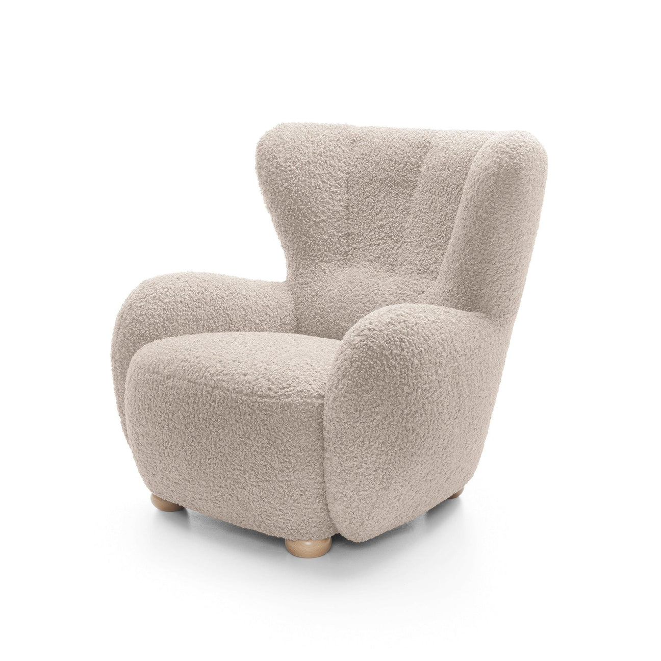
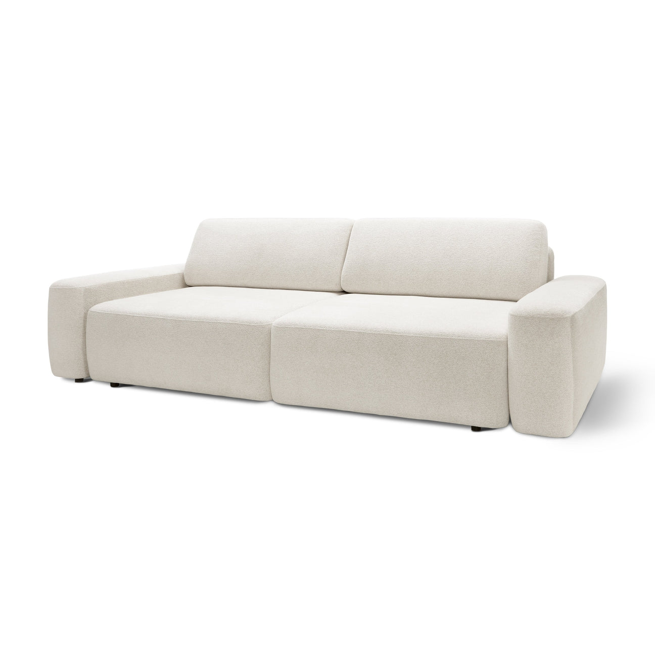
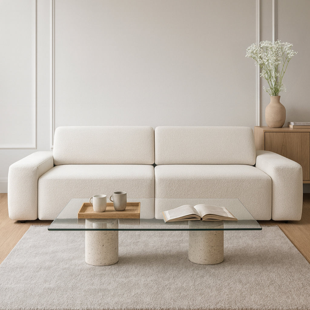
Colors aren't just decorative. They're about emotions, moods, stories, and the rhythm of a space. A well-chosen palette can transform a small apartment into a bright loft, energize a kitchen, or transform a bedroom into a haven of peace. But how can you combine colors so that the interior is neither boring nor overly garish? Here's a comprehensive guide for those who want to consciously build their style.

Base Palette: Start with the Foundations
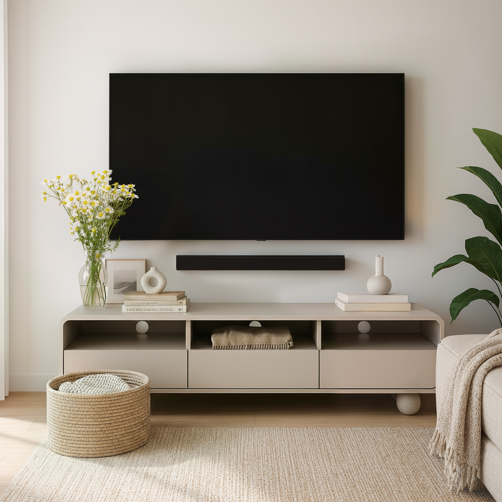
The basis of a successful arrangement is the selection of 2-3 base colors that will serve as a backdrop for the rest.
Most often these are:
-
white (clean, creamy, warm),
-
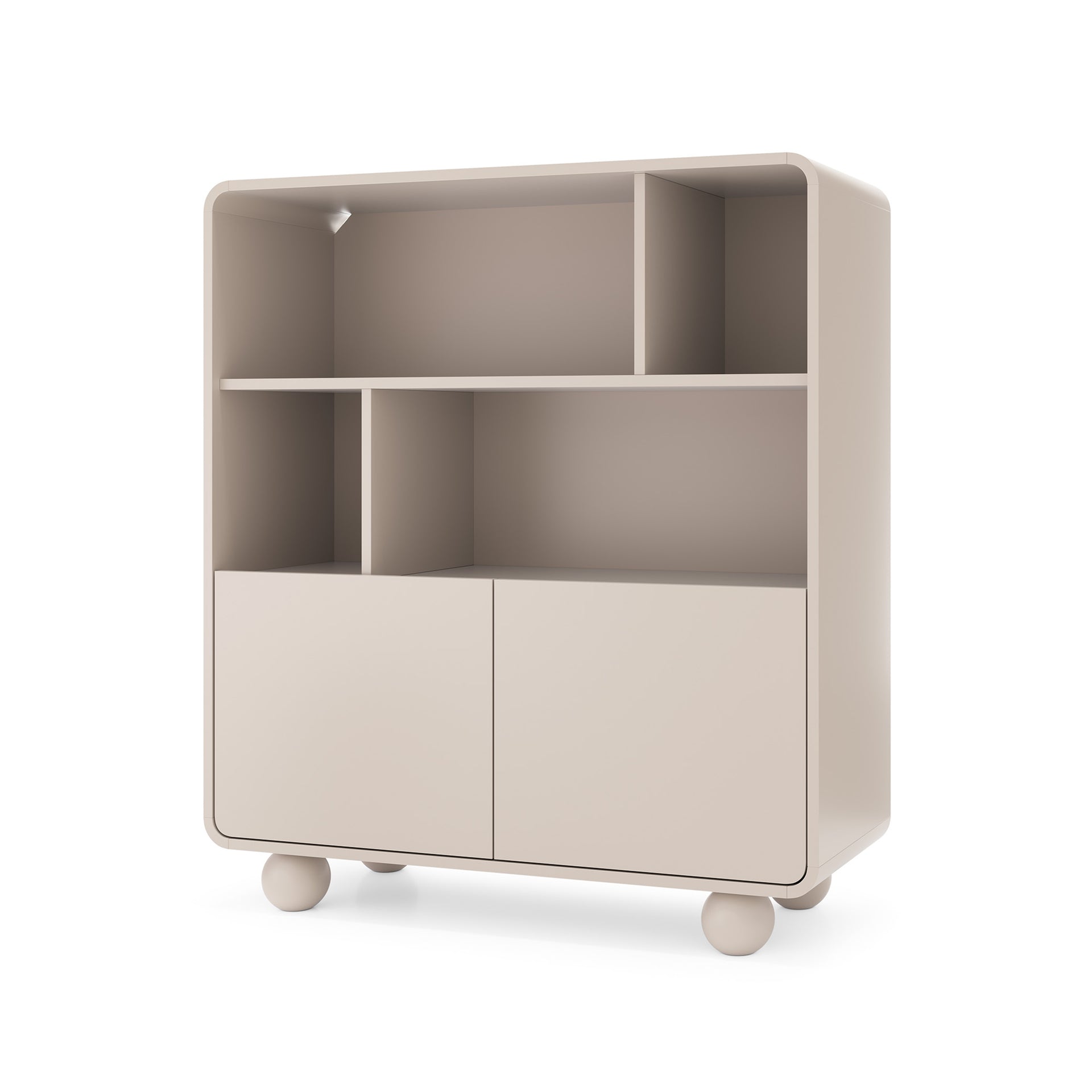
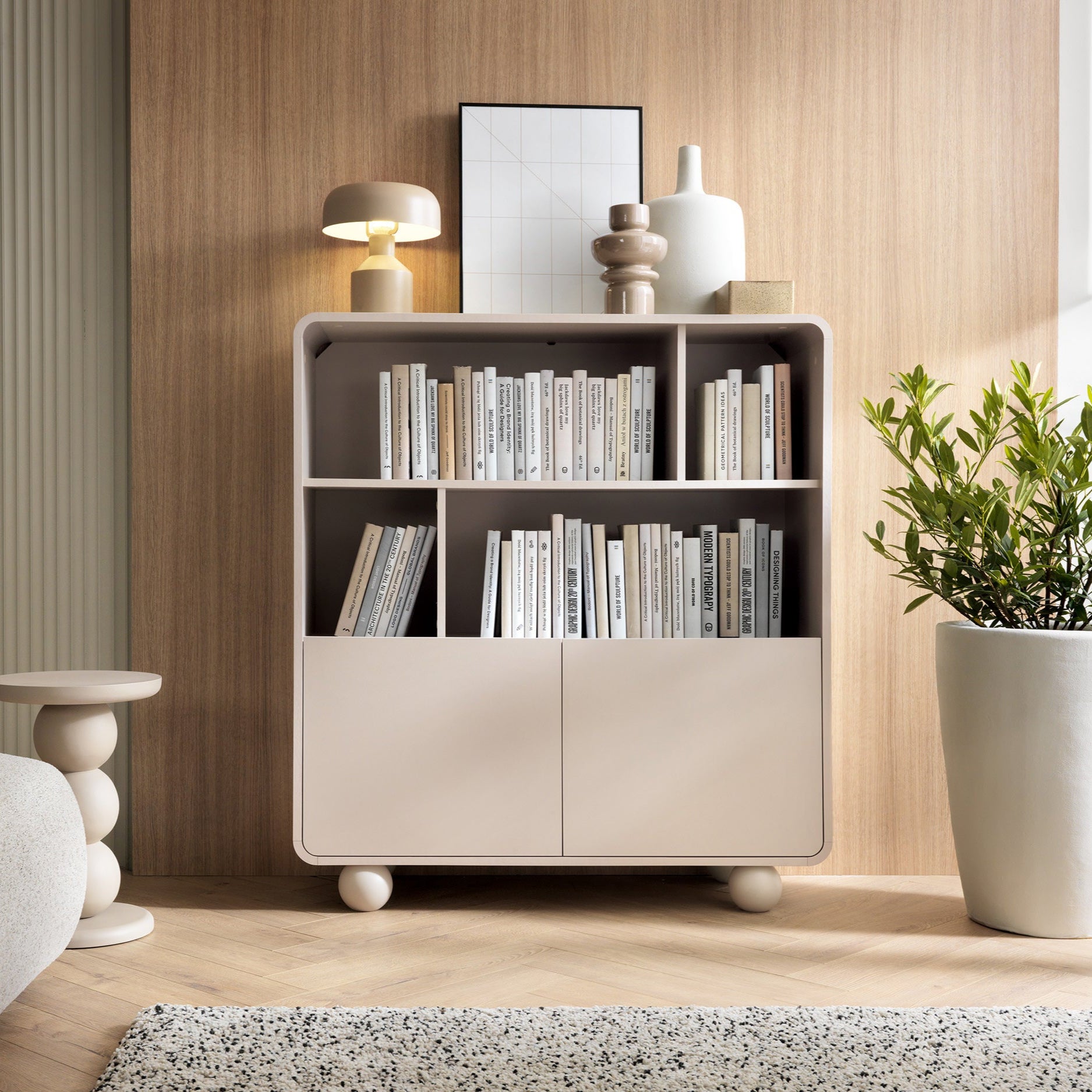
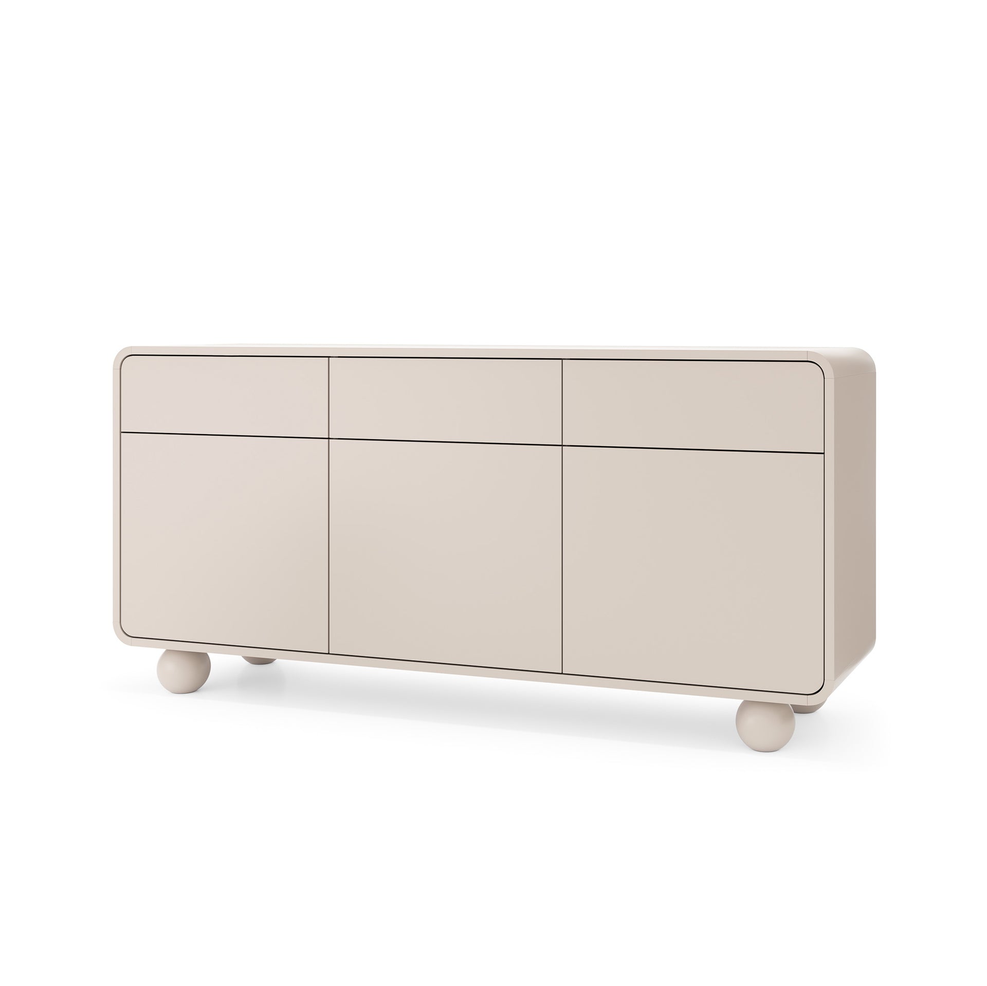
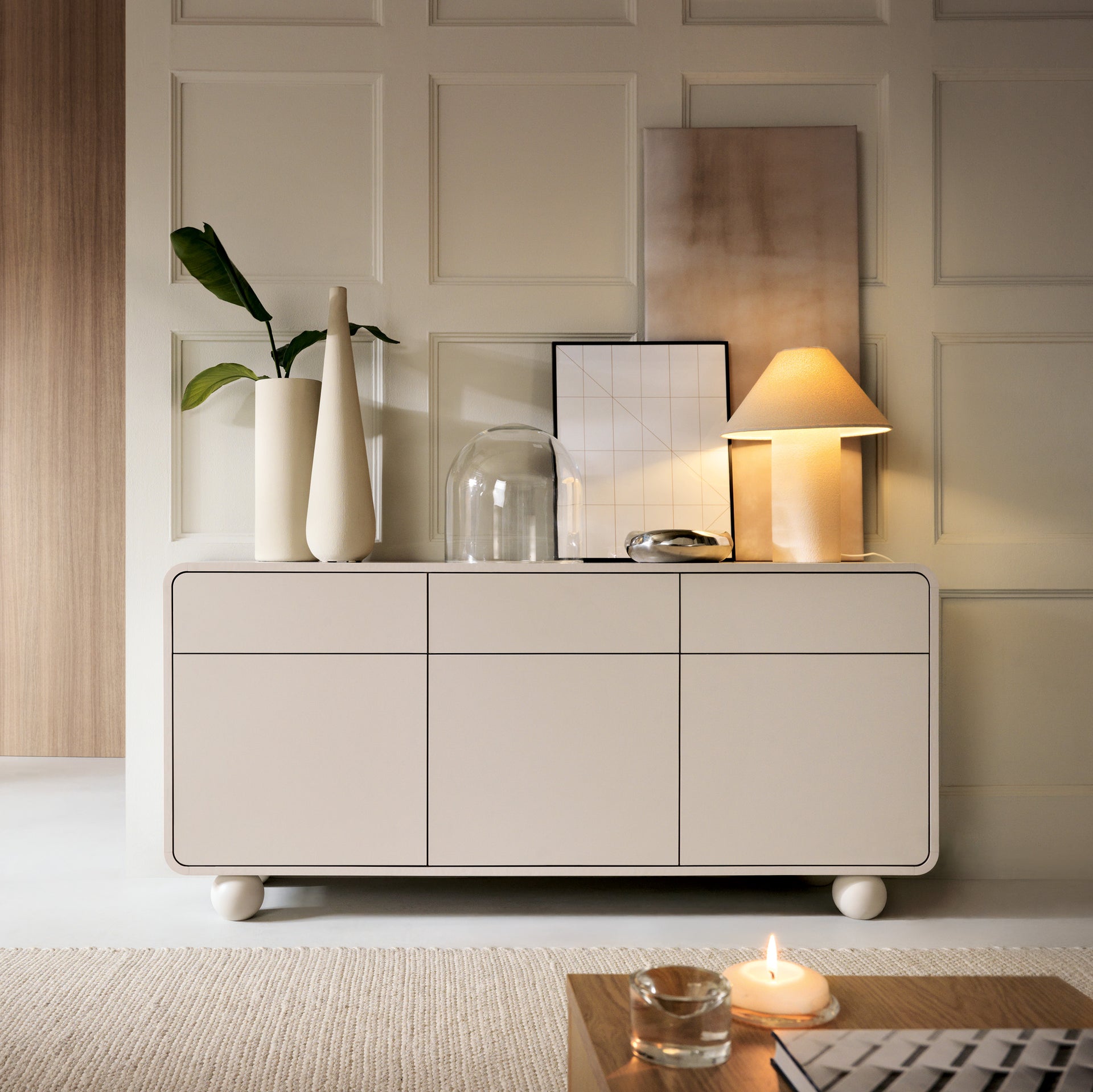
beiges and grays,
-
warm pastels (vanilla, powder pink, sand),
-
delicate green or blue.
Base colors should dominate:
-
walls,
-
large furniture (sofa, bed, wardrobes),
-
textiles (curtains, carpets, bedspreads).
Tip: The base palette makes up 60% of the interior's color scheme. It should be calm, timeless, and adapted to the room's natural light.
Accent color: the strong point of the composition
A color accent is like a spice in a dish – it enhances the flavor of the whole.
You can choose:
-
energetic color (e.g. mustard, burgundy, indigo),
-
contrasting color (e.g. green to pink, blue to orange),
-
trend color of the year (e.g. Peach Fuzz, Viva Magenta).
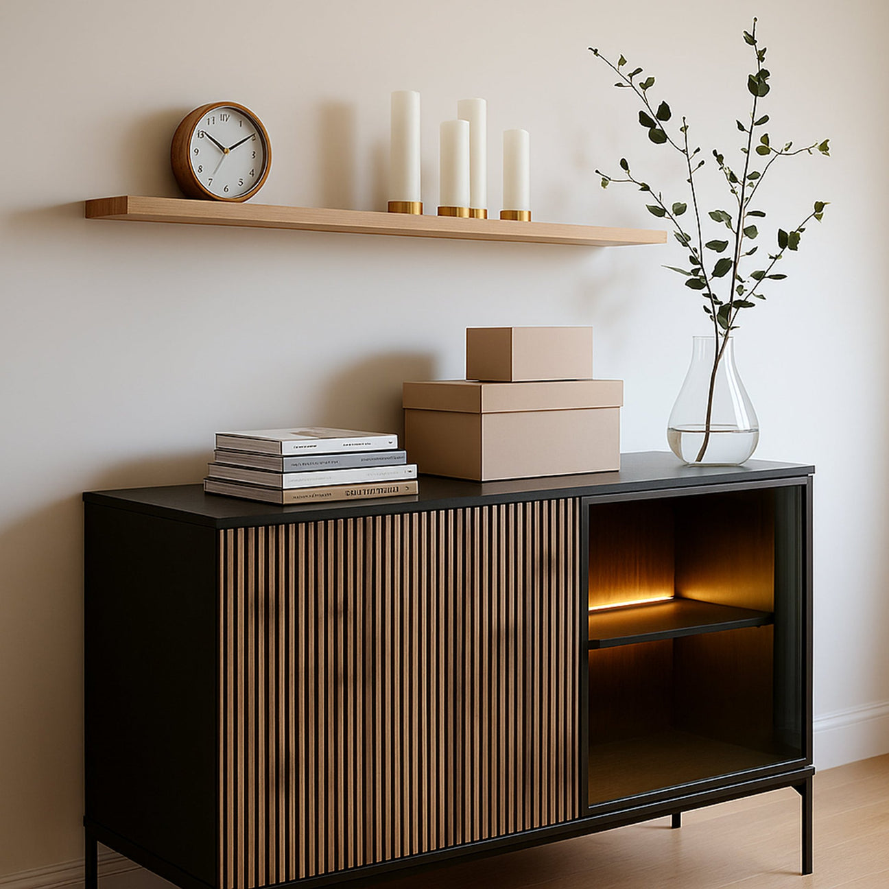
Apply an accent to 10–15% of the interior space:
-
decorative pillows ,
-
ceramics and decorations,
-
one piece of furniture (e.g. armchair, pouffe, chair),
-
poster or work of art.
Tip: You don't have to repeat it everywhere. A few points that "break" the base are enough.

Transition Colors: Subtle Connectors
It is a good idea to introduce 1–2 “transition” colors between the base and the accent.
These may be:
-
muted versions of basic colors,
-
pastel accent varieties,
-
neutral warm or cool tones.
Their role?
-
combine all the elements into a coherent whole,
-
prevent visual chaos,
-
they add depth and sophistication to the arrangement.
Tip: A transitional color can be dominant in textile accessories, frames, smaller pieces of furniture, or ceramics.
The Color Wheel: Your Best Helper
The rules for combining colors are based on the color wheel. It's worth knowing a few basic methods:
-
Complementary colors (they lie opposite each other):
e.g. navy blue + orange, green + red
-
Analogous colors (are next to each other):
e.g. blue + lilac + purple
-
Triad (3 colors equally spaced):
e.g. Yellow + blue + red
Knowledge of the color wheel allows you to build:
-
dynamic interiors (contrasts),
-
harmonious interiors (related colors),
-
creative interiors (unusual combinations).

Natural Inspiration: Learn from Nature
The best color combinations are often found in nature:
-
beach: beige + white + sand + blue
-
forest: green + brown + moss + amber
-
lavender field: purple + gray + dusty pink
-
vegetable garden: tomato red + basil + cream
Create a mood board inspired by a place you love: a seaside town, a country kitchen, an Alpine chalet. Bring its atmosphere into your interior.
Style and color: match the character of the interior
Colors should support the interior style:
-
Scandi: white, light gray, muted green
-
Boho: curry, turquoise, coral, olive
-
Japandi: vanilla, taupe, dark wood, pure black
-
Vintage: burgundy, mustard, mint, dark green
-
Glamour: navy blue, bottle green, pink, gold
Make sure your palette aligns not only with your furniture but also with your lifestyle. Colors can energize or soothe you.

Avoid chaos: less is more
Too many colors are a common mistake. Follow the 60-30-10 rule:
-
60% base color,
-
30% transition color,
-
10% accent color.
If you have doubts, choose:
-
tones of one color (e.g. pinks from powder to raspberry),
-
safe contrasts (e.g. navy blue + caramel),
-
monochromatic interior with one strong accent.
Practical tips from Pillovely:
-
Before you buy paint, test the color on a section of the wall in daylight and artificial light.
-
Choose one dominant color for the entire apartment and change accents depending on the room.
-
Pillowcases are the cheapest way to achieve a color transformation.
-
Use apps to create palettes (e.g. Coolors) and mood boards (e.g. Canva).
In conclusion: the color is you
Your home isn't a museum of trends. It's a space meant to tell your story. Therefore, combine colors not only according to the rules, but also according to intuition. Do you like woodsy? You'll love olive. Do you love retro? Mustard and mint are a perfect match. Let color evoke emotions, memories, and the rhythm of your day. And then your interior will truly take on meaning. Be inspired by the Pillovely collection and create a space that plays with your colors.
See also:


