
Remember Rysiek's apartment from "Miodowe lata"? Or the Kiepski family's kitchen, where every inch screamed for a designer's help? Or perhaps your own student apartment, where a Nirvana poster sat next to a picture of the Virgin Mary, and the whole look was completed by a sofa found near a dumpster? These decorating blunders aren't just the domain of pop culture – we all have our youthful sins in our closets (or on the walls). At Pillovely, we believe that mistakes are the best teachers, so we've collected the biggest decorating blunders among Poles. Because "You are someone" – someone who can learn from others' mistakes instead of repeating them in your own home.
Mistake #1: Everything is for show – or the Grandma's Window Syndrome
Problem
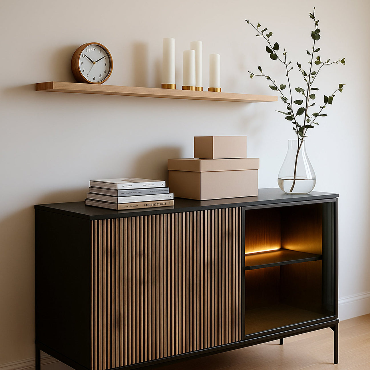
Remember those display cases full of crystal for every occasion? Glasses from your aunt's wedding, vases from your First Communion, figurines from Cepelia? Today, we make the same mistake with "Instagram shelfie"-style shelves – everything has to be out in the open, everything has to be visible. The result? Instead of a stylish interior, we have a museum of random objects.
How to avoid
The 70/30 rule – 70% of things hidden, 30% on display. It's like a good movie – you don't show all the special effects at once. Choose a few items that really mean something. The rest? Go to a cupboard, a box, maybe the attic. Remember: minimalism isn't about a lack of things; it's about consciously choosing what to show.
Seasonal rotation – like an art gallery. In spring, tulips in a vase, in autumn, candles, in winter, a centerpiece. You don't have to show your entire collection at once. It's like a playlist – 20 good songs are better than 200 random ones.

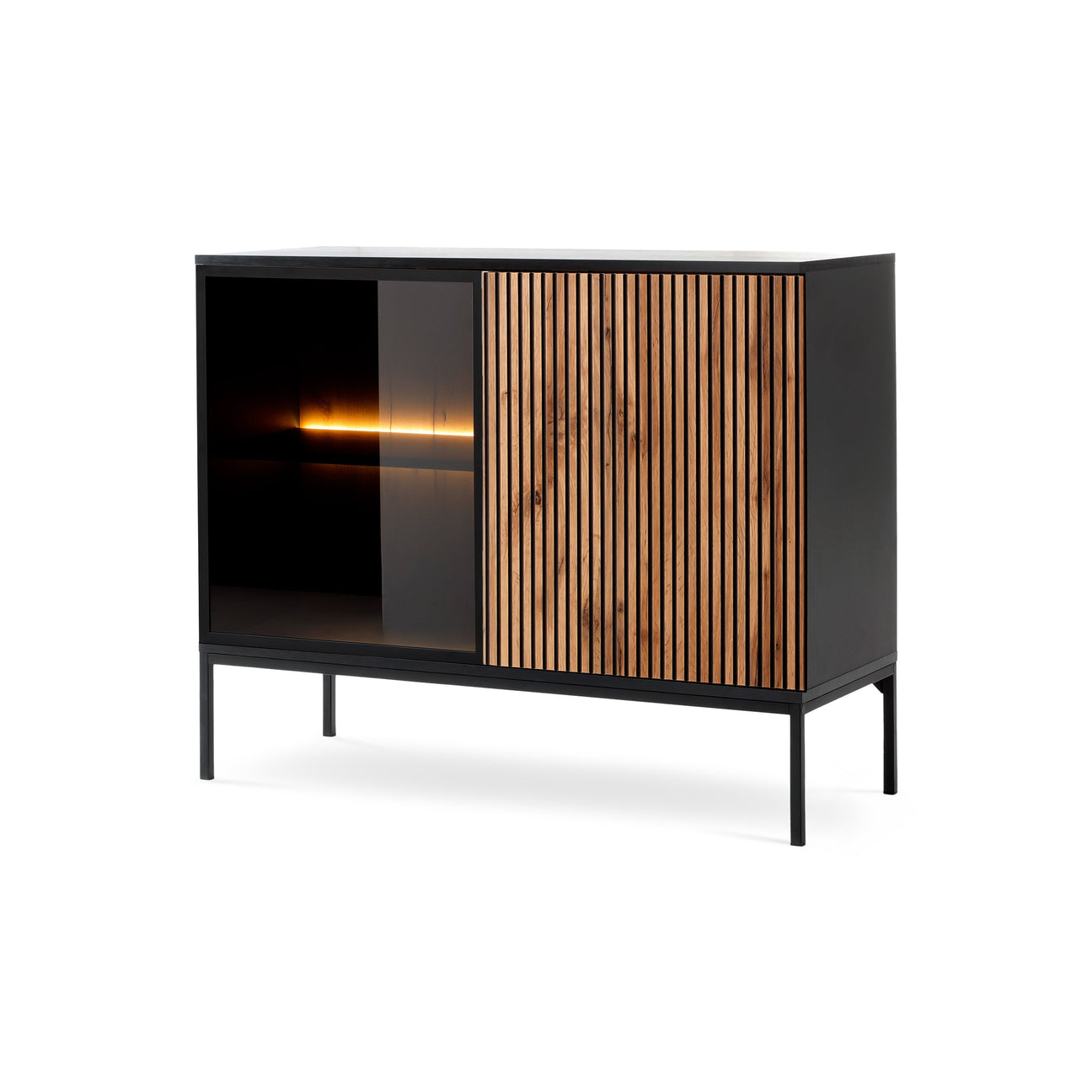
Mistake #2: The Furniture Tower of Babel – When Styles Conflict
Problem
A Louis XV sofa (grandmother's), an industrial coffee table (because it was on sale), Scandinavian armchairs (because it's trendy), an oriental rug (a gift from my mother-in-law). Sound familiar? It's like a band playing a different song—maybe each one is good on its own, but together they're a cacophony.
How to avoid
Find a common denominator – color, material, era. If you like eclecticism, let it be deliberate. The rule of three – no more than three styles in one room. It's like "Kogel-mogel" – the chaos was intentional, and that's why it worked.
A neutral base, bold accents. The sofa and larger pieces in calm colors, and a touch of fun in accessories. It's easier to change a pillow than a couch when you tire of the tropical trend.
Mistake #3: Fifty shades of beige – when we are afraid of color
Problem
Poland's color trauma is real. After years of living among blue tiles and green paneling, the pendulum has swung the other way. Now everything is beige, gray, and white. Like a black-and-white film – artistic, but sometimes lacking life.
How to avoid
The 60-30-10 color rule: 60% dominant (neutral) color, 30% supporting color, 10% accent. It's like the Perfect song – "Nie płacz Ewka" was black and white, but red lips changed everything.
Start small – a colorful pillow, a picture, a vase. Afraid? Plants are a safe way to introduce color. Green always works, and when you get tired of it, you give it to a neighbor.

Mistake #4: Interrogation Room Lighting
Problem
One ceiling lamp = one big mistake. It's like the lighting in "Pitbull" during the audition—harsh, unpleasant, revealing every imperfection. Or the other extreme—just lamps, candles, and the dim light of a movie theater.
How to avoid
At least three light sources in a room: general (ceiling), task (desk, reading), and ambient (decorative). It's like a theater – different lights for different scenes.
Dimmer is your friend. Bright in the morning for makeup, cozy in the evening for a TV show. An investment on par with a movie ticket, with an effect like a Wajda director's piece.
Mistake #5: Size Doesn't Matter – or Scale Issues
Problem
A small table next to a large sofa, like a Fiat next to a truck. Or, conversely, a large table in a small dining room, where squeezing sideways is the norm. It's like Zenek Martyniuk at the Philharmonic Hall – it may be cool, but it doesn't fit the space.
How to avoid
Measure, measure, measure. And not just the furniture, but also the walkways. At least 60 cm for free movement. It's not paranoia, it's planning.
The 2/3 rule – the rug should take up 2/3 of the space under the furniture, the painting 2/3 of the sofa's width. It's like the proportions in "Time of Honor" – everything was balanced, so it looked authentic.

Mistake #6: Textile Schizophrenia – When Patterns Fight
Problem
Plaid, stripes, flowers, geometry – all in one room. It's like watching every episode of "L jak miłość" at once – too much stimulation.
How to avoid
One dominant pattern, the rest subdued. Or different patterns in the same color palette. Like a good band – every instrument is audible, but they play harmoniously.
The principle of scale – large pattern + medium + small. Never three of the same. It's like the cast of "Clan" – diversity, but within the framework of a single story.
Mistake #7: Gallery of Failed Art – or walls full of chaos
Problem
Pictures hung haphazardly, at varying heights, randomly grouped. Or the other extreme – everything in a single line, like at a tax office.
How to avoid
Paper templates – cut out the shapes of the images from paper, tape them together. Rearrange them as you like, without making any holes in the wall. It's like a costume rehearsal for "Dancing with the Stars" – first the rehearsal, then the show.
The rule of center – either align to the center of the composition (57 inches from the floor is the museum standard) or align to the top/bottom edge. Chaos must be controlled, as with Bareja – apparent chaos, but everything is well thought out.

Mistake #8: Trends are like tattoos – forever is too long
Problem
A brightly colored wall because "that's what they showed on the show." Furniture in an ultra-trendy shape that will be passé in a year. It's like Krawczyk's hairstyle from the '90s – once the height of fashion, now... well, exactly.
How to avoid
Trendy accessories, classic furniture. It's easier to change a leopard-print pillow than a sofa. Paint is the cheapest way to transform – if you get tired of it, repaint it.
Invest in quality basics – a good sofa, a sturdy table, a comfortable bed. Let trends be like spices – they add flavor, but they don't constitute the foundation of a dish.
Mistake #9: Plant Apocalypse – When the Jungle Gets Out of Control
Problem
Instagram says: more plants! The result? The living room resembles the greenhouse in Łazienki Park, only without the gardener. Half of it withered, half grew like the baobabs in "The Little Prince."
How to avoid
Start with tough plants: zamioculcas, sansevieria, pothos. They'll outlive anything, like a Nokia 3310. One large plant > ten small ones. The wow factor without the rainforest effect.
Grouping – three pots together look better than three separately. Different heights, similar pots. It's like a boy band – each different, but they fit together.

Mistake #10: Sentimental prison – when we can't say goodbye
Problem
"It's a souvenir..." and suddenly the apartment is a museum of family heirlooms. Each piece of furniture has a story, but together they create a story of horror. It's like "The Ranch" – sentiment is nice, but it can't dominate the present.
How to avoid
The rule is one souvenir per person. Grandma's armchair – yes, but not the entire set. Choose what truly moves you, the rest – a photo as a keepsake, and bye-bye.
Refresh instead of throw away. Old dresser + new paint = vintage with character. Like a remix of a classic hit – respect for the original, but with a fresh twist.
Bonus Mistake: Perfectionism is paralyzing
Problem
Waiting for the "perfect moment," the "perfect budget," the "perfect inspiration." The result? Empty walls for five years because "we haven't found THAT painting yet."
How to avoid
Better is the enemy of good. Start somewhere—you can always change. A home isn't a museum, it's a place to live. As Kora sang: "You have time, use it, don't waste it."
Evolution, not revolution. One room at a time, one project a month. It's a marathon, not a sprint. Like "For Better or For Worse" – it takes years because it's done piece by piece.

The Golden Rule of Pillovely
The biggest mistake? Forgetting that your home should serve you, not the other way around. The most beautiful interior is one in which you feel truly yourself. Does that mean a Metallica poster next to an icon? If that's you, why not? A leopard-print couch? If it makes you happy, go for it.
Loving the warmth of home is loving a space that reflects you. Imperfect, a bit chaotic, but authentically yours. Like Polish reality – not always as beautiful as a catalog, but genuine and familiar.
Remember – every designer starts with mistakes. The difference between an amateur and a professional? A professional has already made every possible mistake and knows how to avoid them. You have an advantage – you can learn from ours.
And finally: the best design is the kind you don't notice—because it simply works. Like a good song—you don't analyze every chord, you just feel it's right. That's what we wish for you—homes that are simply right. Without mistakes? Impossible. But with mistakes that add character? That's art.