


- by Daniel Pawlik
Color Theory for Furniture – how to perfectly combine colors and find the ideal furniture for your home
- by Daniel Pawlik
Some rooms stay with us a lifetime – Grandma's living room with its warm mustard yellow, the children's room in soft mint green, or that first apartment with the rebellious deep blue sofa. Colors tell stories, they evoke memories and change the atmosphere of our own four walls. Understanding the basics of color theory not only allows you to design your home stylishly but also personally – as a stage for your own story.
In this guide, we show you how to select furniture that matches each other and highlights your character, using sound color knowledge. It's not about following trends, but about creating the right mood for your everyday life.
Color theory describes how colors interact, complement each other, or clash. What has been studied as a science since Goethe's theory of colors is, in everyday life, an astonishingly practical aid: it allows you to create harmony instead of chaos in a room, without having to study interior design. Those who apply a conscious color theory to their furnishing avoid common mistakes – too many competing tones, cold rooms, or an atmosphere that just doesn't feel right.
Before choosing a new piece of furniture, it's worth taking an honest look at what you already have. Which colors dominate? What mood should the room convey? What memories do you want to evoke?
Mini-checklist before buying furniture:
Note the three main colors of your room (wall, floor, largest piece of furniture).
Determine the desired atmosphere: calm, lively, classic, or modern.
Consider the lighting conditions – northern light cools colors, southern light warms them.
Check the size of the room: dark tones appear intimate, light tones open up the space.
Pay attention to material colors such as oak wood or brass, which also belong to the palette.
We recommend always looking at color samples in the actual location – preferably at different times of the day. What looks elegant in the store can appear completely different at home.

The color wheel is the most important tool for color design. On a circle, primary colors (red, yellow, blue), secondary colors (orange, green, purple), and tertiary colors are arranged. With this circle in mind, you can immediately recognize which tones get along and which attract each other.
The principle of complementary colors in color theory is particularly exciting: colors opposite each other on the wheel create the greatest contrast. Blue and orange, red and green, yellow and purple – these pairs bring energy into a room. This is precisely why complementary colors in furnishing are so powerful: a dark blue sofa against a terracotta-colored wall, for example, or an olive green armchair next to a rust-red rug.
However, complementary colors should be used sparingly. If two strong contrasting colors are used in equal amounts, the eye struggles between them. The better solution: use one tone dominantly, the other as an accent.
Three classic color schemes for furniture:
Monochromatic: different shades of one color (e.g., light, medium, and dark green).
Analogous: three adjacent colors on the color wheel (e.g., blue, blue-green, green).
Complementary: two opposite colors with different intensities.
If you want to learn more about choosing fabrics and color nuances for upholstered furniture, our separate fabric guide provides detailed information on velvet, bouclé, and linen.
Color psychology deals with the emotional impact of individual tones. This is more than esoteric embellishment – it is measurable. Studies show that blue rooms lower the pulse and promote concentration, while warm red tones stimulate sociability and appetite. Using this knowledge in furniture selection creates spaces that not only look good but also feel right.
Overview of the effect of the most important colors:
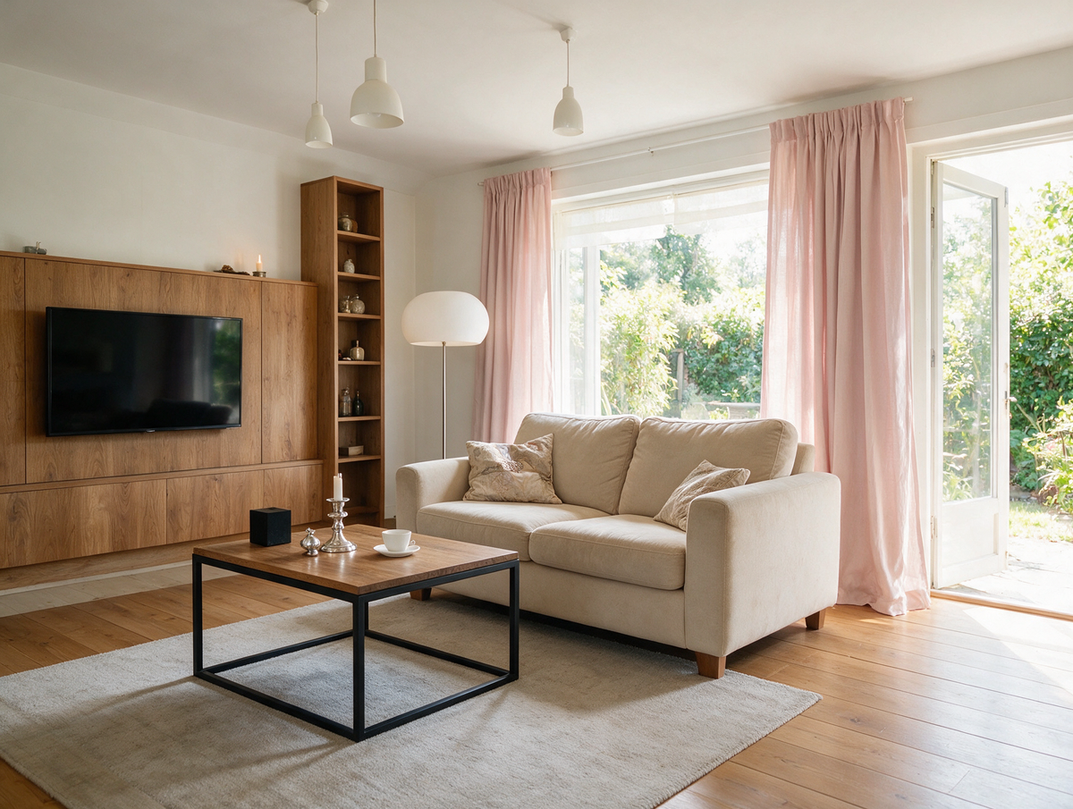
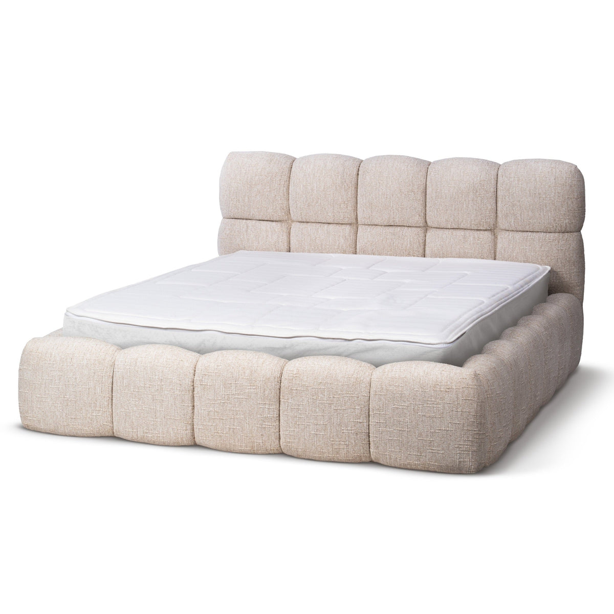
Beige and Sand: timeless, calming, ideal for bedrooms and living rooms.
Olive Green and Sage: grounding, close to nature, perfect for retreats.
Deep Blue: concentration-promoting, elegant, suitable for studies and libraries.
Mustard Yellow: nostalgic, lively, evokes childhood memories.
Terracotta: warm, earthy, instantly creates a sense of security.
Anthracite: modern, intimate, feels like a dark sweater on a rainy day.
We advise incorporating the function of a room into the color decision. A bedroom benefits from muted, cool tones, while the kitchen or dining room can handle warm, inviting colors. In the living room – that space where favorite movies play, friends laugh, and memories are made – a mix of both works best.
Don't forget: wood tones also contribute to the mood. Light oak appears friendly and Nordic, dark walnut looks like a piece of furniture from an old family movie.
Color mixing isn't about actually stirring pigments, but about the art of cleverly distributing colors in a room. A proven method is the 60-30-10 rule: 60 percent of the area gets the dominant color (usually walls and large furniture), 30 percent a secondary color (sofa, curtains, rug), and 10 percent belongs to the accent (cushions, vases, pictures).
This division prevents exactly what makes many living rooms uncomfortable – a jumble of tones where the eye finds no rest. With the 60-30-10 division, a calm stage is created instead, where individual pieces can shine.
Practical tips for harmonious combining:
Repeat each accent color in at least two places in the room so it doesn't seem accidental.
Use textures to keep a monochrome composition interesting – linen, velvet, and wool together.
Mix a maximum of two types of wood to avoid visual clutter.
Introduce plants: green is the natural bridge color between almost all tones.
Check the result in daylight and evening light before making final purchases.
Those who build their home like a well-composed album – with highlights, quiet passages, and a common thread – achieve a living experience that is more than the sum of the furniture. At pillovely.de you will find pieces in precisely these coordinated tones that harmoniously complement existing color palettes.

Which colors go with beige furniture?
Beige is one of the most versatile base tones. It harmonizes with almost all earthy colors – olive green, terracotta, mustard yellow, and chocolate brown. Cool accents like deep blue or anthracite also work, provided they are used as a contrast.
How many colors can I combine in one room?
The rule of thumb is: a maximum of three main colors plus one to two accent colors. More quickly creates a restless impression. The 60-30-10 rule is a reliable guide here.
How do I combine strong colors without it looking kitschy?
Use strong tones sparingly and combine them with muted complementary colors. A bright red sofa looks more elegant if the walls are in a warm greige, rather than pure white.
Which color makes a small room appear larger?
Light, cool tones like off-white, light gray, or sage reflect light and visually open up the space. It is important that the furniture also stays within a similar tone family to avoid abrupt changes.
Is a color experiment worthwhile if I'm unsure?
We recommend starting with small accents – a colorful armchair, a rug, or a throw blanket. This allows you to experience the effect before changing an entire wall or a large piece of furniture.
Color theory is not a rigid set of rules, but a tool for more confidence in furnishing. Those who know the basic principles can consciously break them – and that's where personal style begins. At Pillovely you will find furniture in a color palette that is guided by memories, moods, and real life moments. Browse through the categories at your leisure and discover which tones best tell your story.
If you liked this text, be sure to check out our other inspirations:
Small Wardrobe – Space-Saving Solutions for Every Room: Models, Tips, and Buying Guide
Loveseat - What Is It, Who Is It For and How to Choose the Right One?
A loveseat is one of those pieces of furniture that can completely change how a room works. It is smaller than a classic sofa, more generous than a single armchair and often easier to place in compact interiors. A loveseat can create a cosy sitting area in a small living room, soften a bedroom corner, complete a reading nook or work as an additional seat next to a larger sofa. Its strength lies in proportion: it gives you the feeling of a sofa without taking over the whole room.
Read moreabout Loveseat - What Is It, Who Is It For and How to Choose the Right One?
EU vs UK Bed Sizes – Will UK Bedding Fit a European Bed?
European beds are 200 cm long, UK beds 191 or 198 cm. A simple EU vs UK bed size table in cm – and what it means for your mattress and fitted sheets.
Read moreabout EU vs UK Bed Sizes – Will UK Bedding Fit a European Bed?
Autumn colors at home – shades that bring peace and warmth
Do you remember autumn from your childhood, when the leaves changed color like a kaleidoscope, and your mom would pull out the pumpkin-colored sweater she'd worn since college? Or those evenings in front of the TV while a storm raged outside, and the lamplight in the house gave everything a warm, amber hue? Those were the days when no one talked about "color palettes" or "color stories"—colors simply existed, as natural as breathing. Today, when we can choose from 50 shades of gray (and no, I'm not talking about THAT book), we sometimes lose track of what truly makes a home feel cozy. At Pillovely, we believe that autumn colors aren't a trend—they're a return to what makes us feel safe. Because "You are someone"—someone who deserves a space filled with colors that snuggle like a grandma's blanket.
Read moreabout Autumn colors at home – shades that bring peace and warmth



Share:
Small cabinet – space-saving solutions for every room: models, tips, and buying guide
Vinyl Shelf - Discover Stylish Storage for Vinyl & Turntables