


Do you remember that moment when you first looked at an autumn tree and thought, "I wish my living room looked exactly like that"? This is no coincidence. Autumn is nature at its most beautiful – a palette of colors so perfectly composed that no designer could have come up with anything better.
The golden yellow of maple leaves, the deep red of grapes, the warm brown of chestnuts, the misty gray of the October sky. These colors appeal to us on a primal level, evoking associations with home, warmth, and security. They awaken in us the desire to snuggle up in a soft sweater and stay home with a cup of hot tea.
Autumn colors in interior design are not a trend that comes and goes. It's a return to roots, to the natural and timeless. This is how you create a home that is beautiful not only in autumn but all year round.
The Psychology of Autumn Colors
Why do autumn colors have such an effect on us? It's not just a matter of aesthetics – it's a profound color psychology that goes back to our evolutionary roots.
Warm Tones = Security
Brown, beige, and golden yellow – these are the colors of the earth, protection, and the warmth of a hearth. For millennia, these shades have symbolized home and security for people. That's why interiors painted in autumn colors automatically create relaxation.
Orange and Red = Energy and Joy
Although autumn is associated with the end, autumnal reds and oranges are vibrant colors. They evoke the colors of the setting sun, ripe fruits, and warmth. In interiors, they provide energy without appearing aggressive like the neon colors of summer.
Muted Greens = Harmony and Peace
Olive green, khaki, sage – these are the colors of autumn grass, moss, and lichens. They evoke nature, not its wildness, but its harmony. In interiors, they have a calming effect and are easy on the eyes.
Gray and Brown Tones = Stability and Elegance
These are the colors of an autumn sky, bare branches, and damp earth. While they may seem melancholic, in an interior, they form an elegant base for other colors. It's a background that allows a colorful accent to shine.
The Main Colors of the Autumn Palette
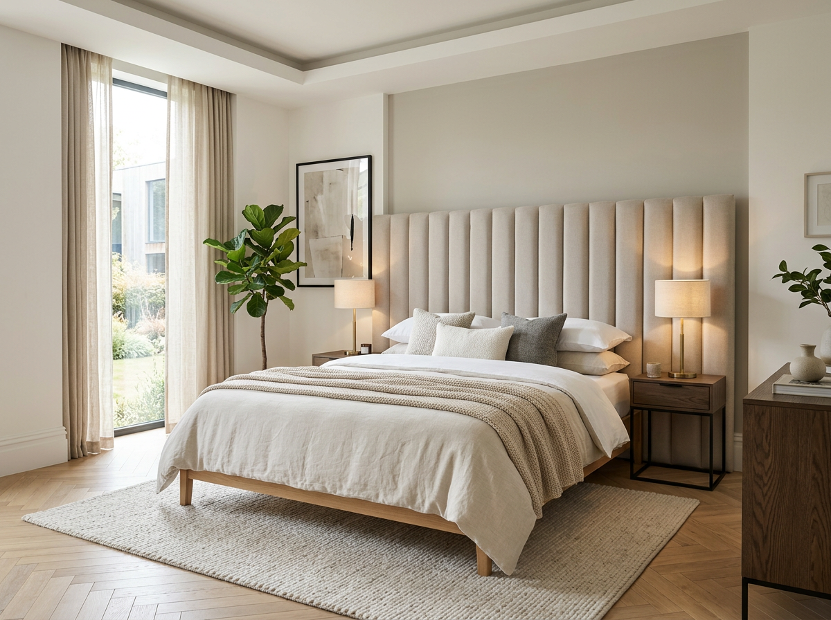
Warm Beige Tones – The Basis of Everything
Beige is a color that never goes out of style. In autumn, it takes on a special meaning – it becomes warmer, more golden. It is the perfect base color for any interior.
In the living room, beige walls provide a backdrop that highlights colorful accessories. In the bedroom, they create an atmosphere of calm and relaxation. In the kitchen, they make the room appear larger and brighter.
Beige comes in dozens of shades, from cool beige with a gray undertone to warm honey beige. In autumn, we prefer warmer shades – sand, caramel, and cream.
Brown Tones
Brown is the color of earth, wood, and autumn leaves. In an interior, it can appear elegant and modern or rustic and cozy – it all depends on the shades and combinations.
Light brown – the color of milk chocolate – works well for large rooms. It doesn't feel oppressive but radiates warmth. Dark brown – the color of dark chocolate – adds accents and gives the interior character.
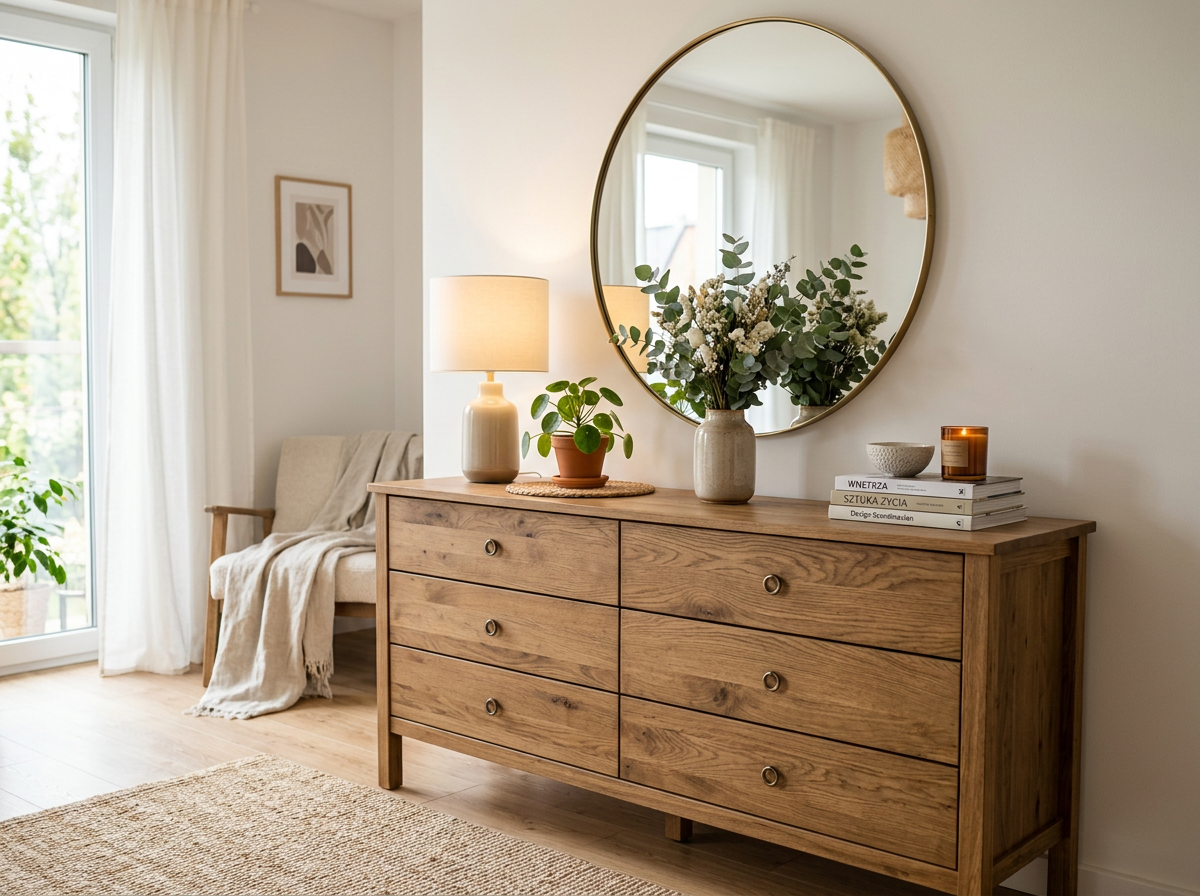
Pillovely's chests of drawers in natural wood tones are a perfect example of how elegant and functional brown can be. These pieces combine traditional craftsmanship with modern design, creating timeless furnishings.
Rust Red – The Warmth of Home
Autumn red is not a bright scarlet, but a warm, rusty red. The color of bricks, autumn leaves, and ripe apples. This red warms, it doesn't excite.
In the living room, rust red works well as an accent color – a wall, an armchair , and cushions. In the dining room, it can be the main color, creating an atmosphere of warmth and hospitality.
Caution is advised with this color – it can easily be overdone. Used correctly, however, it creates interiors full of character and elegance.
Golden Yellow – Sunshine for Your Home
Autumn yellow is not a bright neon color, but a warm, honey-like shade. The color of autumn leaves, ripe grain, and the setting sun.
Yellow visually enlarges a room and adds brightness. In dark rooms, it can replace the missing sun. In rooms with plenty of natural light, it creates an atmosphere of eternal summer.
Golden yellow pairs beautifully with browns and beiges. It can also create contrasts with navy blue or bottle green.

How to Combine Autumn Colors?
The 60-30-10 Rule
This is the basic rule for combining colors in an interior. 60% is the dominant color (usually a neutral beige or gray), 30% is the main color (perhaps an autumnal shade), and 10% is an accent color.
For example: beige walls (60%), brown Pillovely chest of drawers (30%), rust-colored cushions and accessories (10%).
Warm with warm, cool with cool
Autumn colors are primarily warm tones. They harmonize best with each other: beige with brown, golden yellow with orange, rust red with terracotta.
Autumn Colors in Different Rooms
The Living Room – The Heart of the Home
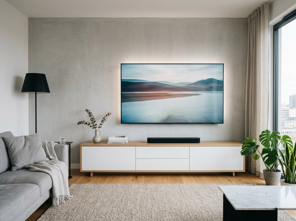
The living room is where we spend most of our time. Therefore, the colors must be pleasant all year round. Autumn tones are perfect for this.
Beige walls provide a universal base. A brown chest of drawers is not only a practical storage solution but also an elegant piece of furniture. The Pillovely collection offers furniture that combines functionality with timeless design and a touch of nostalgia.
Bedroom – An Oasis of Calm
A bedroom in autumn colors guarantees restful sleep. Warm beige and brown tones have a relaxing effect, while golden accents create coziness.
A chest of drawers is an essential piece of furniture in the bedroom – a place to store small treasures, early school reports, or a collection of handmade cups. Pillovely creates furniture specifically for those who value order as much as the warmth of home.
Kitchen – The Warmth of Home
The kitchen, decorated in autumn colors, is the heart of the house. The warm brown tones of the wooden furniture, the beige tiles, and the terracotta accents create a hospitable atmosphere.
Accessories in Autumn Colors
Textiles – The Easiest Way to Transform
Cushions, throws, curtains, and rugs are the easiest way to bring autumn colors into your interior. It doesn't require renovation, doesn't cost a fortune, and the effect is immediately noticeable.
Organization with Character
For those who like to have everything in its place, autumn colors are a great way to create order with character. Scented candles in warm shades, wooden organizers, and ceramic containers in earthy tones – all of these find their place in functional furniture.
Plants – Bold Color Accents
Autumn plants are natural color complements. Begonias in orange, chrysanthemums in shades of yellow, and heather in purple.
Practical Tips
Test Colors Before Painting
Colors look different in different lighting. Before painting an entire wall, buy a paint sample and paint a section of the wall. Observe the color for a few days under different lighting conditions.
Start with Small Spaces
If you've never used bold colors before, start small. A single rust-colored wall instead of an entire room. Orange cushions instead of an entire sofa.
Invest in Furniture with Character
When choosing furniture in autumn colors, pay attention to quality and timeless design. Pillovely's chests of drawers are an example of furniture that combines functionality with aesthetics – they not only store things but also adorn the interior with their timeless lines.
Consider Proportions
The more intense the color, the less of it you need. Rust red can be beautiful, but only as an accent. Too many intensely colored surfaces can be overwhelming.
Think Long-Term
Autumn colors are not just an autumn trend. They are timeless shades that are beautiful all year round. Invest in durable pieces of furniture and large accessories in neutral tones, and add bright colors through easily changeable accents.

Pillowovely – Autumn Colors in Practice
At Pillovely, we know that true beauty lies in the details. That's why our chests of drawers are not just functional furniture but an expression of your lifestyle. For all those who want more – more order, more character, more homely warmth.
Our furniture in neutral, autumnal wood tones is an investment in timeless elegance. These pieces of furniture remain beautiful for decades, regardless of changing trends.
Visit pillovely.de and discover a furniture collection for all those who value order, functionality, and homely warmth.
Autumn colors in interior design are more than just a trend. They create a home where you truly feel at home. Warm, cozy, full of peace and harmony. A home that embraces you and says, "Stay, you are safe here."
Because that's what this love for the warmth of home is all about: colors that make home a place you return to with a smile.
Pillovely – for those who want more.



Share:
How to store blankets, pillows, and other small items without creating a mess
How to Store Documents? 5 Tricks for Storing Notes, Books, and Accessories in a Small Apartment