


- by Damian Jerzy Zadora
Autumnal Colours in the Home – Hues That Bring Peace and Warmth
- by Damian Jerzy Zadora
Do you remember autumn from your childhood, when the leaves changed colors like a kaleidoscope, and your mom would pull out her pumpkin-colored sweater from the closet, the one she'd worn since college? Or evenings spent in front of the TV, while a storm raged outside, and the lamplight inside cast everything in a warm, amber glow? Back then, no one talked about "color palettes" or "color stories" – colors simply existed, as naturally as breathing. Today, when we can choose from 50 shades of grey (and no, I'm not talking about THAT book), we sometimes lose track of what truly makes a home cozy. At Pillovely, we believe that autumn colors are not a trend – they are a return to what gives us security. Because "you are someone" – someone who deserves a space full of colors that's as cozy as Grandma's blanket.
Autumn colors are no accident. They are the result of millions of years of evolution (as National Geographic says), which have taught us to associate warm colors with safety, a hearth, and protection from winter. Our brain sees brown and thinks: stability. It sees orange and feels: warmth. It sees burgundy and knows: coziness.
It's like a soundtrack to a movie – the right colors create the right mood. Autumnal hues lower blood pressure, slow the pulse, and signal to our nervous system: "Relax, you're home." In times when stress is our middle name and burnout is just around the corner, surrounding ourselves with calming colors isn't a whim – it's mental hygiene.
Pantone announced it, designers were thrilled, and IKEA released an entire collection. Cinnamon is the new black. But not the bright, bland kind – rather deep, saturated, like the spice in mulled wine. It's a color that:
Goes with everything (seriously, check it out)
Warms even the most sterile interior.
Looks expensive, even in the Pepco version
Where to use cinnamon: Cushions, blankets, a single accent wall. Don't overdo it – too much cinnamon is like too much cinnamon in an apple pie.
Green, but not like a spring meadow. Sage green is a green that has undergone therapy – calm, balanced, mature. Like Meryl Streep among colors – elegant in every role.
It pairs perfectly with:
White (classic)
Beige (calm²)
Terracotta (for the brave)
Where: Bedroom (sleep like in a spa), bathroom (Zen vibes), kitchen (freshness without shouting).
Terracotta had its five minutes of fame in the 90s (remember the flower pots?). Now it's back as Warm Terra – more refined, less flashy. It's like Pokémon evolution – same essence, higher level.
Shades:
Rust (rust, but glam)
Clay (clay, but chic)
Brick (brick, but soft)
Was purple associated with Prince and the 80s? Forget it. Deep Plum is a matured purple – deep, mysterious, refined. Like wine that has aged long enough.
Note: Use sparingly. It's like perfume – a drop makes a difference, a bottle is overkill.
It's not about Trump-style gold. Golden Hour is a warm, honey-colored hue, like the light at sunset. Subtle yet transformative. It adds luxury without screaming, "Look at me, I have money."
Where it works wonders:
Details (frames, handles, candlesticks)
Fabrics (curtains in this color = instant elegance)
Lighting (light bulbs at this temperature)
Was brown passé? Not anymore. But not the brown of 2000s youth furniture. Chocolate brown is a brown worthy of a Milka commercial – you just want to bite into it. Deep, saturated, and a feel-good color.

60% dominant color (neutral – beige, gray, white) 30% supporting color (this is where autumn tones come in) 10% accent (strong color for character)
It's like putting together an outfit – pants and jacket are understated, the shirt adds character, the tie makes the statement.
You don't have to paint your entire house cinnamon at once. Start with:
Cushion covers (cheapest makeover ever)
Blanket for the sofa (instant fall)
Vases, candlesticks (details that make a difference)
Paintings, posters (art in autumn colors)
An accent wall in autumn colors is like a statement necklace – one element that changes everything. Which wall?
Behind the sofa (classic)
In the bedroom behind the bed (maximum coziness)
In the dining room (appetizing background)
Pro tip: Washable wallpaper = you can change your mind without renovating.
Different shades of the same color. Beige + caramel + chocolate = sophistication. It's like tone-on-tone clothing, but for your home.
Sage + terracotta = wow. Plum + gold = elegance. Cinnamon + pomegranate = unconventional, but it works. It's like food pairing – sometimes the most unusual combinations taste the best.
White, gray, and beige as a base. Autumn colors as accessories. With a calm base, you shouldn't overdo it. It's like the little black dress – everything goes with it.
Velvet cushions in autumn colors are like a double espresso – double the effect. Color + texture = autumn at its best.
Chunky knit blankets and cushions. They don't just look autumnal – they feel autumnal. A multi-sensory experience, like 4DX in the cinema.
Natural materials in warm tones. Wooden bowls, rattan baskets. Like in Las Vegas – what happens in nature stays in your home.
Copper, brass, antique gold. Cool metal + warm tone = balance. Like fire and ice in "Game of Thrones" – opposites that create harmony.

2700K-3000K – these are your friends. Warm light highlights autumn colors. Cold light (4000K+) destroys all the magic. It's like an Instagram filter – choose wisely.
Candlelight is the best friend of autumn colors. The flickering brings life to the room, and the warm hue highlights the colors. And the scent (pumpkin spice, anyone?)
Not just for the holidays. Warm LEDs instantly create an autumnal mood. Like a cheat code in a game, they instantly elevate the mood to a new level.
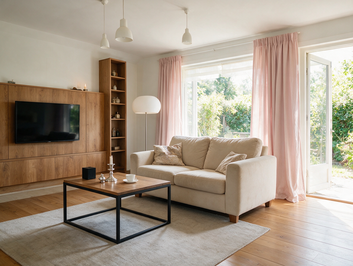
Here you can let your soul unwind. Cinnamon cushions, a terracotta blanket, golden details. The living room is the stage, autumn colors are the costumes.
Sage, light, warm terra, and delicate browns. Here it's about sleep, not show. Like a lullaby, it should soothe, not excite.
Terracotta, cinnamon, warm yellows. Colors that stimulate appetite. But on the walls, not on entire pieces of furniture (unless you like living on the edge).
Sage + wood + white accents = instant Zen. Add candles and plants. Your own spa, without leaving the house.
A strong accent – perhaps a wallpaper with an autumn pattern? Or a copper-framed gallery wall? First impressions count.

An entire apartment in pumpkin colors? That's not autumn, that's Halloween horror. Balance, people, balance.
North-facing window + dark colors = depression. Check how the color looks in different lighting. It's like casting – you need to see it in different scenes.
Autumn colors without a neutral background are like a non-stop concert – tiring. Give it some time.
Autumn colors can last all year round. It's not a Christmas tree – you don't have to put it away in January.
Old cushion covers + fabric dye = new life in autumn colors. Like Pokémon evolution, just cheaper.
Terracotta spray for regular flower pots. Instant autumn collection. Pinterest level achieved.
Branches with colorful leaves in a vase. Free decoration courtesy of Mother Nature.

Cushion covers
Autumn-colored candles
DIY decorations
Statement blanket/throw
Curtains in a new color
Various decorations (vases, frames)
Painting a wall
New armchair in an autumn color
Wallpaper for one wall
Autumn colors in the home are not a fleeting TikTok trend. They are a return to the natural, to the warming, to the scent of grandma's apple pie. In a world where everything is fast, instant, and disposable, surrounding yourself with colors that say, "Slow down, breathe, you are home," is an act of rebellion.
At Pillovely, we believe that "loving the warmth of home" also means loving the colors that create that warmth. You don't have to renovate your entire home. Sometimes, a cinnamon pillow, a terracotta vase, or a sage wall is enough. Small changes, big impact.
Because in autumn, home isn't just about colors. It's that feeling when you come home after a long day and the space says, "Hello, I've been waiting." It's a visual comfort that transforms into emotional comfort. It's like a hug, but in the form of an interior.
So, this autumn, treat yourself to color. For warmth that doesn't just come from the radiator. For a space that says: Here you can unwind, here you can be. Because a real home isn't the one from the catalog – it's the one that reflects your colors. And autumn? Autumn merely suggests a palette.
Loveseat - What Is It, Who Is It For and How to Choose the Right One?
A loveseat is one of those pieces of furniture that can completely change how a room works. It is smaller than a classic sofa, more generous than a single armchair and often easier to place in compact interiors. A loveseat can create a cosy sitting area in a small living room, soften a bedroom corner, complete a reading nook or work as an additional seat next to a larger sofa. Its strength lies in proportion: it gives you the feeling of a sofa without taking over the whole room.
Read moreabout Loveseat - What Is It, Who Is It For and How to Choose the Right One?
EU vs UK Bed Sizes – Will UK Bedding Fit a European Bed?
European beds are 200 cm long, UK beds 191 or 198 cm. A simple EU vs UK bed size table in cm – and what it means for your mattress and fitted sheets.
Read moreabout EU vs UK Bed Sizes – Will UK Bedding Fit a European Bed?
Autumn colors at home – shades that bring peace and warmth
Do you remember autumn from your childhood, when the leaves changed color like a kaleidoscope, and your mom would pull out the pumpkin-colored sweater she'd worn since college? Or those evenings in front of the TV while a storm raged outside, and the lamplight in the house gave everything a warm, amber hue? Those were the days when no one talked about "color palettes" or "color stories"—colors simply existed, as natural as breathing. Today, when we can choose from 50 shades of gray (and no, I'm not talking about THAT book), we sometimes lose track of what truly makes a home feel cozy. At Pillovely, we believe that autumn colors aren't a trend—they're a return to what makes us feel safe. Because "You are someone"—someone who deserves a space filled with colors that snuggle like a grandma's blanket.
Read moreabout Autumn colors at home – shades that bring peace and warmth



Share:
A Living Room to Dream About – How to Create a Space for Conversation
Which Is Better for Sleeping: Sofa or Sleeper Sofa? A Guide to Nightly Decisions