


- by Damian Jerzy Zadora
How to combine colors in interiors? Learn more about the color palette.
- by Damian Jerzy Zadora
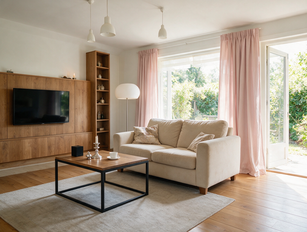
Colors are not just decorative. They convey emotions, moods, stories, and the rhythm of a space. A well-chosen color palette can transform a small apartment into a bright loft, energize a kitchen, or turn a bedroom into an oasis of tranquility. But how do you combine colors so that the interior is neither boring nor too garish? Here's a comprehensive guide for anyone who wants to consciously shape their style.

The foundation of a successful arrangement is selecting 2-3 base colors that will serve as the background for the rest.
Most common are:
Base colors should dominate:
Tip: The base palette accounts for 60% of the interior's coloring. It should be calm, timeless, and adapted to the room's natural light.
An accent color is like a spice in a dish – it enhances the flavor of the whole.
You have a choice of:
Place an accent on 10-15% of the interior:
Tip: You don't have to repeat it everywhere. A few points that "break up" the base are enough.

It's a good idea to introduce 1-2 "transitional colors" between the base and the accent.
These can be:
Their role?
Tip: A transitional color can dominate in textile accessories, frames, smaller furniture pieces, or ceramics.
The rules for combining colors are based on the color wheel. It's worth knowing some basic methods:
Knowing the color wheel allows you to create:

The best color combinations are often found in nature:
Create a moodboard inspired by a place you love: a coastal town, a country kitchen, an alpine chalet. Bring that atmosphere into your interior.
Colors should support the interior design style:
Make sure your color palette matches not only your furniture but also your lifestyle. Colors can give you energy or soothe you.

Too many colors is a common mistake. Follow the 60-30-10 rule:
If in doubt, choose:
Your home is not a trend museum. It's a space that tells your story. So, combine colors not just by the rules, but also by your feelings. Do you like wood? Then you'll love olive green. Do you love retro? Mustard yellow and mint will be a perfect match. Let colors evoke emotions, memories, and the rhythm of your day. This way, your interior will gain meaning. Be inspired by the Pillovely collection and create a space that plays with your colors.
See also:
Loveseat - What Is It, Who Is It For and How to Choose the Right One?
A loveseat is one of those pieces of furniture that can completely change how a room works. It is smaller than a classic sofa, more generous than a single armchair and often easier to place in compact interiors. A loveseat can create a cosy sitting area in a small living room, soften a bedroom corner, complete a reading nook or work as an additional seat next to a larger sofa. Its strength lies in proportion: it gives you the feeling of a sofa without taking over the whole room.
Read moreabout Loveseat - What Is It, Who Is It For and How to Choose the Right One?
EU vs UK Bed Sizes – Will UK Bedding Fit a European Bed?
European beds are 200 cm long, UK beds 191 or 198 cm. A simple EU vs UK bed size table in cm – and what it means for your mattress and fitted sheets.
Read moreabout EU vs UK Bed Sizes – Will UK Bedding Fit a European Bed?
Autumn colors at home – shades that bring peace and warmth
Do you remember autumn from your childhood, when the leaves changed color like a kaleidoscope, and your mom would pull out the pumpkin-colored sweater she'd worn since college? Or those evenings in front of the TV while a storm raged outside, and the lamplight in the house gave everything a warm, amber hue? Those were the days when no one talked about "color palettes" or "color stories"—colors simply existed, as natural as breathing. Today, when we can choose from 50 shades of gray (and no, I'm not talking about THAT book), we sometimes lose track of what truly makes a home feel cozy. At Pillovely, we believe that autumn colors aren't a trend—they're a return to what makes us feel safe. Because "You are someone"—someone who deserves a space filled with colors that snuggle like a grandma's blanket.
Read moreabout Autumn colors at home – shades that bring peace and warmth



Share:
What are interior design styles? The most popular interiors in 2025
Climbing plants for the home – the trend for naturalness. Check it out!