


- by Daniel Pawlik
Cashmere colour in interior design – how to use it in modern furniture and décor?
- by Daniel Pawlik
In short: Cashmere is a warm, light shade that blends beige, gray and a delicate pink – neither cold nor too warm. At Pillovely, the Cashmere color is available for the Roza chests of drawers and TV unit and for the Sabi chest of drawers, among others. Combine it with white, wood, bottle green or navy and gold accents, ideally in soft, natural light.
Cashmere—a color once associated solely with luxurious fabrics—is now triumphant in modern interior design. This subtle, elegant shade, combining beige, gray, and a delicate pink, has become a timeless trend. If you're looking for a color that will bring harmony, coziness, and timeless elegance to your home, cashmere is the solution you can rely on. In this guide, you'll discover how to incorporate cashmere into your furniture and décor to create a space brimming with style and tranquility.
Before you begin designing your interior, it's worth understanding what makes cashmere so special. Cashmere is neither too cold nor too warm—its unique tone makes it incredibly versatile and easy to incorporate into a variety of interiors. Unlike classic white, which can sometimes seem cold and stark, cashmere brings warmth and a welcoming feel to a space .
Main features of cashmere color:
Neutrality – blends perfectly with other colors
Versatile – works well in any room of the house
Timeless – never goes out of fashion, regardless of changing trends
Optical warming – makes the room seem cozier
Elegance without ostentation – exudes luxury, but without exaggeration

The living room is a space where cashmere works best. It's here that you can create a cohesive, elegant arrangement in which every element blends harmoniously.
Cashmere works best where you want a calm, warm foundation. A sofa in neutral, warm upholstery is a good starting point, and furniture in cashmere – such as the Roza and Sabi chests of drawers – complements it beautifully. Rounded shapes and a muted color turn the living room into an invitation to relax, without an overpowering visual effect. This combination fits both contemporary and more classic interiors.
Alternatively, the Roza Chest of Drawers in cashmere with gold legs is not only a practical storage solution but also an elegant design element. Its light cashmere color combined with gold accents creates a luxurious and subtle sophistication effect. The gold legs add a modern, delicate touch to the interior, in keeping with current design trends.
In a modern living room, storage is key to order and harmony. The Roza 154x56 TV unit in cashmere is an example of how functionality can meet aesthetics. This elegant unit, available with black or gold legs, not only conceals electronic devices but also becomes a key decorative element in the living room.
Cashmere storage units, such as the Sabi Cashmere Chest of Drawers , offer space for souvenirs, books, and everyday items while maintaining clean lines and a harmonious look. This color doesn't overwhelm – even large cashmere pieces look light and accessible.
A coffee table is the centerpiece of any living room. The Roza Coffee Table in cashmere with gold legs is a perfect choice for those seeking a balance between minimalist simplicity and luxury. Natural wood, refined color, and metallic details create a look that looks expensive yet remains approachable and cozy.
Cashmere coffee tables complement any sofa, regardless of its color. They can become the focal point of a living room or provide a discreet backdrop for more striking accessories.
One of the greatest advantages of cashmere is its versatility. It can be combined with many other shades to create a variety of design effects:
Harmonious combinations:
White and cream – for a light, Scandinavian look
Gray and anthracite – for a more modern, cool character
Natural wood – for a warm, cozy atmosphere
Gold accents – for luxury and sophistication
Bold combinations:
Bottle green – for depth and elegance
Navy blue – for a contrasting, serious look
Bordeaux and burgundy – for a warm, romantic atmosphere
Black with gold – for modern minimalism with a touch of luxury

Cashmere in color combinations
| Combination | Effect in the interior |
|---|---|
| Cashmere + white and cream | a light, Scandinavian look |
| Cashmere + gray and anthracite | a more modern, cooler character |
| Cashmere + natural wood | a warm, cozy atmosphere |
| Cashmere + gold accents | luxury and sophistication |
| Cashmere + bottle green | depth and elegance |
| Cashmere + navy blue | a contrasting, serious look |
| Cashmere + burgundy and wine red | a warm, romantic atmosphere |
| Cashmere + black with gold | modern minimalism with a touch of luxury |
Cashmere reveals its strongest side in the bedroom. This color perfectly promotes relaxation and deep sleep. A cashmere-upholstered bed becomes a haven of security and coziness. Combined with natural fabrics—linen, cotton, or wool— it creates a spa-like atmosphere in your own home.
Cashmere bedside tables and chests of drawers in this color scheme they add coherence and elegance to the bedroom, without giving an overly minimalist, cold atmosphere.
Cashmere works best when paired with natural materials. Wood, linen, wool, and cotton—these fabrics and materials work harmoniously with the cashmere color. When a cashmere-colored coffee table sits on natural linen and a wool cushion sits next to it, the entire arrangement gains strength and authenticity.
At Pillovely, all furniture is crafted from natural materials, making it the perfect choice for those who value cashmere. Natural wood and natural fabrics—a combination that never goes out of style and will last for decades.
Before you start arranging:
Measure the light in the room – cashmere looks most beautiful in natural, soft light
Choose one main piece of cashmere furniture – for example, a sofa or a TV stand
Add contrasting elements to prevent the space from becoming too monotonous
Combine with textures – velvet, linen, wool will emphasize the elegance of cashmere
Don't be afraid of gold accents - they blend beautifully with the cashmere color
Cashmere isn't a one-time fad. It's a color that will last for years, always remaining fashionable and elegant. When you choose cashmere furniture from Pillovely , you're investing in timeless style, functionality, and home comfort.
Discover our full range of cashmere furniture and create a space that tells your story – the story of someone who values elegance, functionality, and authenticity. Remember: you are someone of value, and your home should reflect that.
You choose the Cashmere color as a variant of the furniture below – select it from the color list when ordering:
See also: Chests of drawers and Night stands.
Cashmere is a light, warm, neutral shade that blends beige, gray and a delicate pink. It is neither cold nor too warm, so it suits most arrangements and warms up a room more than classic white, which can feel cold and stark.
White and cream for Scandinavian lightness, gray and anthracite for a modern effect, and natural wood for warmth. Bolder combinations are bottle green, navy and burgundy, while gold accents and black with gold add luxury.
Yes. A light, warm shade visually warms up the room without overwhelming it, even when the cashmere furniture is large. Cashmere looks best in soft, natural light, so check it in your living room in the morning and in the evening.
The Cashmere color is available, among others, for furniture from the Roza collection: chests of drawers 104×83 and 154×83, TV unit 154×56, coffee table 104×46 and bedside table 54×56. You will also find it in the Sabi chest of drawers 104×84 and the Sabi TV unit 154×57.
Yes, it works well in a bedroom because it supports relaxation and deep sleep. Together with linen, cotton and wool it creates a spa atmosphere. An upholstered bed, bedside tables and chests of drawers in this color add cohesion to the bedroom without a cold feel.
Choose one main piece in this color, such as a sofa or a TV unit, and add contrasting elements so the arrangement is not monotonous. Combine it with textures – velvet, linen and wool – and gold details. The gold legs of the Roza chests of drawers are an example.
Cashmere sits between them: it has the warmth of beige, the calm of gray and a delicate pink undertone. Beige is usually warmer and gray cooler. This makes cashmere look less stark than white and less cold than gray.
No. It is a timeless color that does not go out of fashion regardless of trends, because it is based on a neutral, warm base. You can refresh cashmere furniture by changing accessories, without replacing the whole interior.
The safest are white, cream and light beige, which strengthen the light, Scandinavian character. For a bolder effect, choose bottle green or navy. Test the wall color with a sample by the window, because cashmere looks best in soft, natural light.
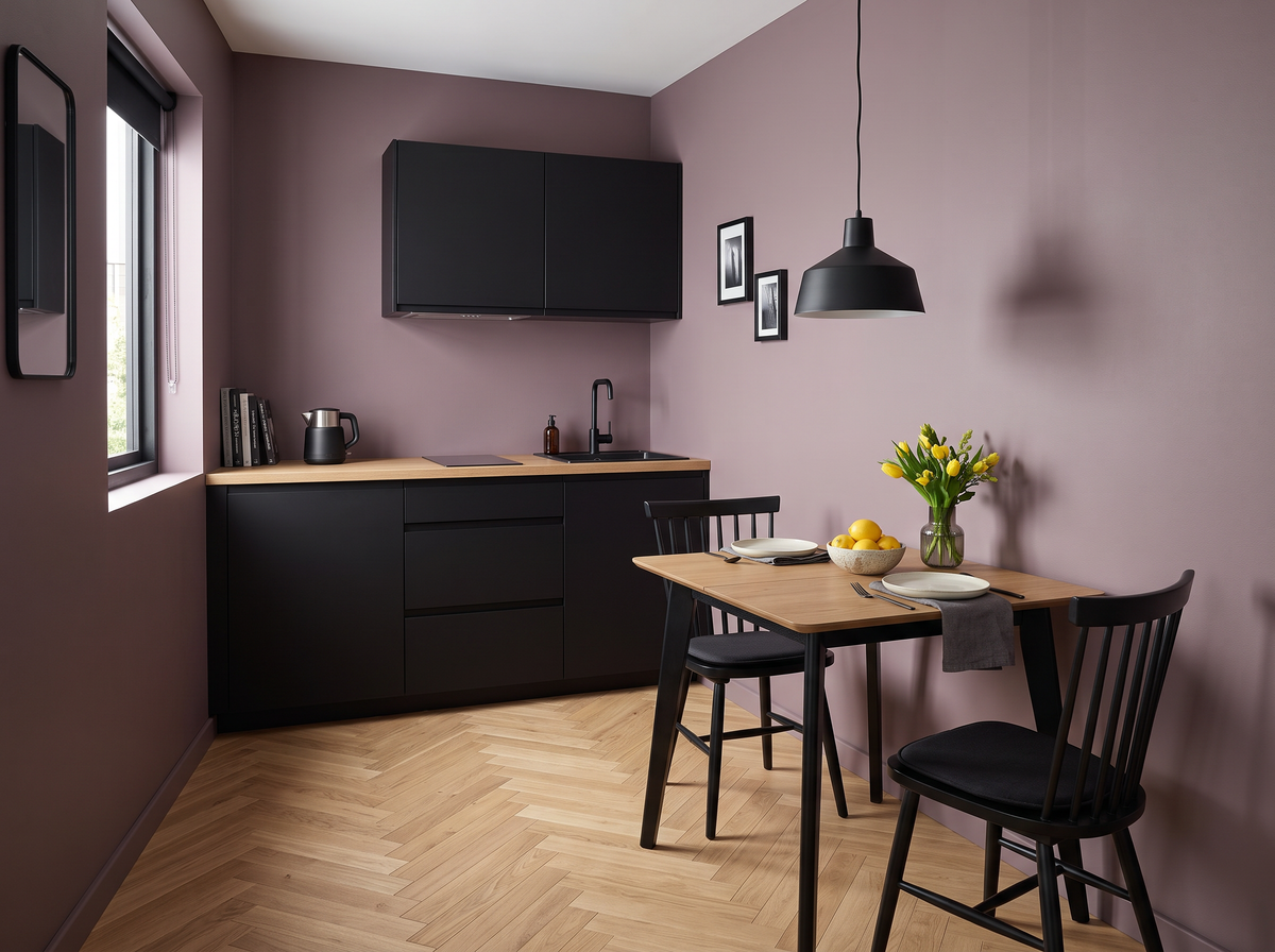
Small Dining Table Ideas: Tables That Work in Compact Rooms
Do you remember the fold-out table that lived against the wall in a childhood flat, pulled out only for Sunday dinner and pushed straight back afterwards so there was still room to walk to the kitchen?
Read moreabout Small Dining Table Ideas: Tables That Work in Compact Rooms
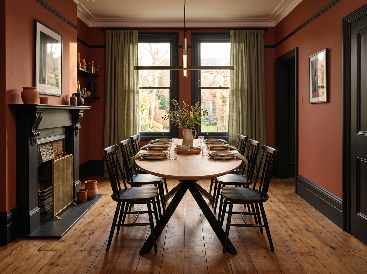
Round vs Rectangular vs Oval Dining Table: Which Shape Fits Your Room?
Do you remember the heavy, round table at your grandparents' house, the one with just enough wobble in one leg that everyone knew to avoid, yet somehow it always sat exactly the right number of people, no matter who turned up?
Read moreabout Round vs Rectangular vs Oval Dining Table: Which Shape Fits Your Room?
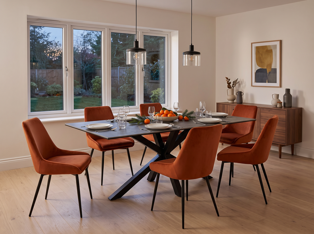
Dining Table Size Guide: How Many People Does a Table Seat?
Do you remember standing in a furniture shop as a child, watching your parents argue good-naturedly over whether "this one" would actually fit the dining room, while you quietly counted how many cousins could squeeze around it at Christmas?
Read moreabout Dining Table Size Guide: How Many People Does a Table Seat?


Share:
Pill Reading Corner: Umberto Eco - The Name of the Rose
Pill Reading Corner: Taylor Anderson - The Destroyer Series