


- by Daniel Pawlik
Living Room Colours – How to Choose the Best Wall Colour for Your Living Room
- by Daniel Pawlik
Every living room has a soundtrack. Not a literal one – the room where your grandmother made coffee on Sunday afternoons, the room where your parents watched films late into the evening, the room in your student flat where you played your first vinyl loud enough to worry the neighbours. Each of them had a colour that stayed with you. The warm yellow of a 1970s kitchen wall. The deep green of a childhood library. The soft blush of a bedroom in a much-watched film. Colour holds memory better than almost anything else.
Choosing living room colours today is partly about trends, partly about light, and largely about which memory you want to sit in every evening. In this guide we walk through how to pick the right shade for your walls, which colours the design world is leaning toward in 2026, how to match a scheme to your existing sofa, and whether light or dark walls suit your room better.
The question "what colour for living room walls?" doesn't have a single answer – it has a few good rules that get you close.
Follow the light. North-facing rooms lean cooler; warm the palette (cream, oat, blush, ochre). South-facing rooms are already warm; you can lean into deeper or cooler tones (sage, teal, plaster).
Test on the wall, not the swatch. Paint A3-sized patches on at least two walls and watch them across three times of day – morning, afternoon, and evening lamp light. A colour that sings at 3 p.m. can sulk at 8 p.m.
Start with what stays. Your floor, your sofa, your existing wood tones – these are the fixed points. Choose walls that flatter them, not fight them.
Consider the mood. Living rooms mostly used after dark work with deeper colours; those bathed in daylight suit lighter ones.
A useful thought: the colour of your walls should feel like the room you'd write about years from now. Bold enough to remember, quiet enough to live with.
Pillovely's own approach leans toward natural, grounded tones – beiges, warm greens, earth neutrals – shades that borrow from nature rather than trend, and hold their appeal across decades. The Pillovely living room collection shows the palette that ages best alongside these tones.

The best living room colours in 2026 belong to a broader shift back toward warmth. After more than a decade of cool greys and clinical whites, interiors are drawing on the earth again – clay, moss, ochre, terracotta, and the deep browns that once defined 1970s living rooms and are now defining new ones. If the previous decade was scored in cold synth-pop, this one plays closer to home – acoustic, wooden, warmer.
The palettes leading the year:
Warm neutrals. Oat, cream, mushroom, greige. Flexible, timeless, and forgiving of everything from vintage inherited furniture to modern sofas. The safest choice that never reads safe.
Sage and olive green. Nature in wall form. Soft enough to feel calm, distinctive enough to feel considered. Works especially well with wood floors and brass accents.
Terracotta and rust. The warmth of a Mediterranean afternoon in your living room. Best in rooms with generous natural light. Pairs beautifully with linen curtains and rattan.
Deep browns and clay. The unexpected comeback of the year – not the cold browns of the 90s, but the warm cocoa and chestnut tones that recall well-loved leather and antique wood.
Blush and plaster pink. Quietly modern. It reads more like sunlit stone than sweet. Increasingly common in living rooms as well as bedrooms.
Deep forest green and moody navy. For rooms that live mainly after dark. Cinematic under lamp light.
What's quietly going out: cool grey walls, stark whites, teal-and-copper colour blocking, and jewel tones used without context. For living room paint colours that will still feel right in five years, choose from these earth-adjacent families. Colours borrowed from nature don't date the way trend colours do.
Choosing wall colours for living rooms usually starts with the biggest existing element – almost always the sofa. The right wall makes it look intentional; the wrong one makes it look accidental.
For a grey sofa:
warm white or cream (adds warmth to cool grey),
sage or olive green (a modern grown-up pairing),
soft blush or plaster pink (grey and pink is quietly one of the most flattering combinations),
deep navy or forest green for a moodier look.
Avoid cool white and stark grey walls – they double the chill.
For a beige or cream sofa:
warm cream or oat (tonal drenching works beautifully),
terracotta or ochre (warmth on warmth),
muted greens (sage, olive, chalky moss),
soft blush or camel.
Avoid pure white walls – they wash the sofa out. If you're pairing walls with a cream sofa, models like the Tola Sofa with Sleeping Function (in Sunny Pearl or Creamy Fluff) or the ALLORO Sofa Bed sit particularly well against warm-earth wall tones.
For a brown sofa (leather or fabric):
cream, oat, or off-white (the classic brown-on-cream combination),
deep green (the library aesthetic – brown leather and green walls is unbeatable),
warm terracotta or rust,
soft yellow or ochre for a 1970s-inspired feel.
Avoid pure grey and cool white – they fight the natural warmth of brown.
Working from a sofa you already own is easier than starting from a wall colour and hoping the right sofa appears. If you're picking both together, the Pillovely sofas collection or the corner sofas range alongside paint samples lets you see how they meet in the light of your actual room.
The question of light versus dark living room wall colours comes down mostly to when you actually use the room.
Light walls (cream, oat, sage, warm white, blush) work well when:
the room gets modest natural light and needs a lift,
the space is compact and needs to feel larger,
you use the room throughout the day rather than mainly in the evening,
you want maximum flexibility for changing accents seasonally,
you're layering with textured fabrics that need a calm backdrop.
Dark walls (forest green, navy, deep terracotta, warm chocolate) work well when:
the room is generously lit or south/west-facing,
you mainly use the room after dark,
you want a cocooning, cinematic atmosphere,
you have strong architectural features to highlight,
you want to layer in rich upholstery and mixed metals.
A middle path worth considering: mid-tone walls – dusty rose, muted sage, warm greige, soft clay. They give you depth without the commitment of true darkness, and hold their character in either light.
One tip that applies in both directions: match your ceiling to your walls (or drop the intensity by half) rather than defaulting to white. The white-ceiling default breaks the tone of the room and dates an interior faster than the wall colour itself.
For living room colour ideas that translate into complete rooms rather than just paint decisions, the full Pillovely living room collection shows how sofas, coffee tables, and armchairs come together across different palettes.

What is the most timeless wall colour for a living room?
Warm cream or oat. Both flatter almost any furniture, adapt across seasons and styles, and rarely date. Sage green and warm greige are close seconds.
Are dark colours a good idea for small living rooms?
Yes, more often than people think. Deep walls without sharp colour transitions to a white ceiling make a small room feel enveloping rather than smaller. Choose warm dark tones (chocolate, terracotta, forest green) rather than cold ones.
How many colours should a living room have?
Usually three. A dominant colour (walls or largest piece), a secondary (upholstery), and one accent (cushions, art, curtains). More than three need careful editing.
What's the best living room colour for a family with children?
Warm, forgiving mid-tones – oat, greige, sage, or soft clay. They hide marks better than white and read warmer than grey. Wipeable matt paint is the practical bonus.
Should the walls match the sofa colour?
No – they should complement it. The wall and sofa in the exact same colour flatten the room. Aim for related tones from the same family rather than identical ones.
A living room's colour holds more than paint. It holds the mornings you'll drink coffee in that light, the evenings you'll fall asleep on the sofa with a film still playing, the songs that will one day take you straight back to the room you're now building. Choose the shade that feels like the room you'll want to keep coming back to. If you're building the whole space from the ground up, the Pillovely living room collection is a warm place to start – with sofas, armchairs, coffee tables, and accessories designed to age well against the earth tones that ground a home.
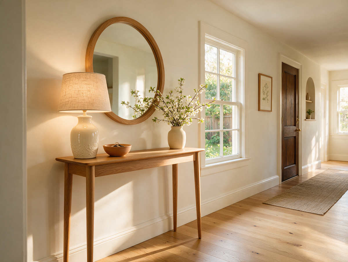
Console Table Ideas – Where to Use One and How to Style It
Do you remember coming home from school and dropping everything on the little table by the front door? Keys in the china dish, letters propped against the lamp, a vase of whatever was flowering in the garden and the old telephone with its curly cord. It was the first thing you saw when you walked in, and somehow it always said: you are home.
Read moreabout Console Table Ideas – Where to Use One and How to Style It
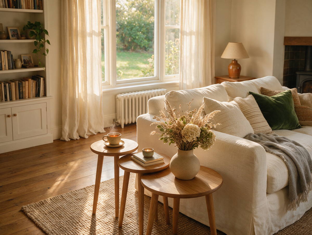
Nest of Tables – What Are They, Who Are They For and How to Style Them
Do you remember Sunday visits to your nan's, when the nest of tables came out from beside the armchair? Three little tables, each tucked neatly under the next, were pulled apart and handed round – one for the teapot, one for the biscuit tin and one for Grandad's crossword – and then slid back together the moment everyone went home.
Read moreabout Nest of Tables – What Are They, Who Are They For and How to Style Them
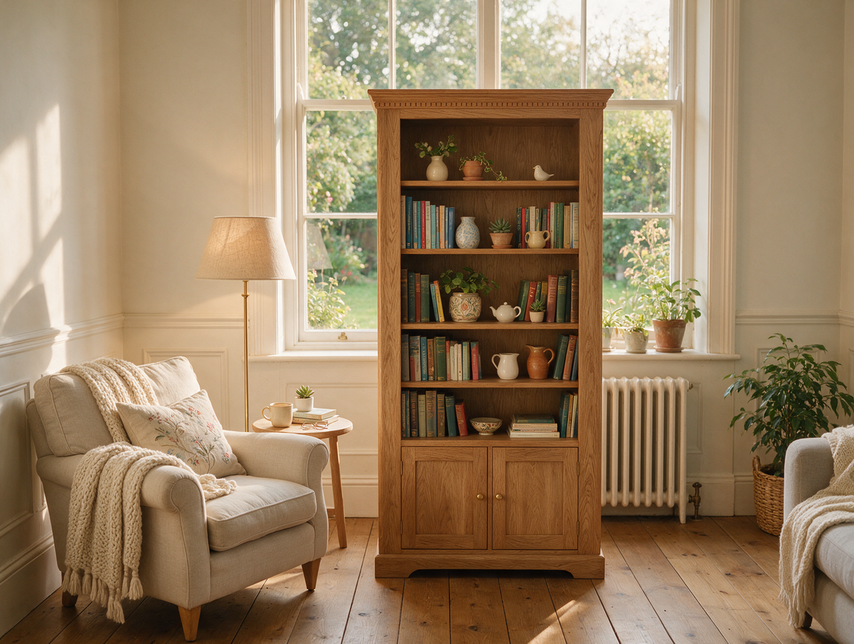
Bookcase Ideas – How to Choose and Style a Bookshelf for Your Living Room
Do you remember the bookcase in your grandparents' front room? Rows of faded paperbacks, a set of encyclopaedias nobody ever finished, holiday souvenirs, a framed school photo and that one heavy atlas you pulled out on rainy afternoons. It was never styled for anyone – and yet it told the whole story of the family.
Read moreabout Bookcase Ideas – How to Choose and Style a Bookshelf for Your Living Room



Share:
Coffee Table – How to Choose and Style the Perfect One for Your Living Room
How to Choose a Sofa – A Complete Buying Guide for Every Home