


- by Damian Jerzy Zadora
How to combine colors in interiors? Learn about the color palette.
- by Damian Jerzy Zadora
Colors aren't just decorative. They're about emotions, moods, stories, and the rhythm of a space. A well-chosen palette can transform a small apartment into a bright loft, energize a kitchen, or transform a bedroom into a haven of peace. But how can you combine colors so that the interior is neither boring nor overly garish? Here's a comprehensive guide for those who want to consciously build their style.

The basis of a successful arrangement is the selection of 2-3 base colors that will serve as a backdrop for the rest.
Most often these are:
Base colors should dominate:
Tip: The base palette makes up 60% of the interior's color scheme. It should be calm, timeless, and adapted to the room's natural light.
A color accent is like a spice in a dish – it enhances the flavor of the whole.
You can choose:
Apply an accent to 10–15% of the interior space:
Tip: You don't have to repeat it everywhere. A few points that "break" the base are enough.

It is a good idea to introduce 1–2 “transition” colors between the base and the accent.
These may be:
Their role?
Tip: A transitional color can be dominant in textile accessories, frames, smaller pieces of furniture, or ceramics.
The rules for combining colors are based on the color wheel. It's worth knowing a few basic methods:
Knowledge of the color wheel allows you to build:

The best color combinations are often found in nature:
Create a mood board inspired by a place you love: a seaside town, a country kitchen, an Alpine chalet. Bring its atmosphere into your interior.
Colors should support the interior style:
Make sure your palette aligns not only with your furniture but also with your lifestyle. Colors can energize or soothe you.

Too many colors are a common mistake. Follow the 60-30-10 rule:
If you have doubts, choose:
Your home isn't a museum of trends. It's a space meant to tell your story. Therefore, combine colors not only according to the rules, but also according to intuition. Do you like woodsy? You'll love olive. Do you love retro? Mustard and mint are a perfect match. Let color evoke emotions, memories, and the rhythm of your day. And then your interior will truly take on meaning. Be inspired by the Pillovely collection and create a space that plays with your colors.
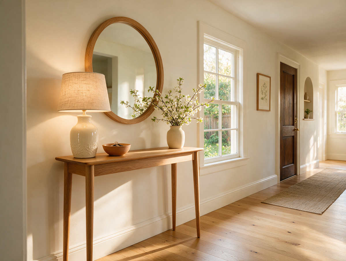
Console Table Ideas – Where to Use One and How to Style It
Do you remember coming home from school and dropping everything on the little table by the front door? Keys in the china dish, letters propped against the lamp, a vase of whatever was flowering in the garden and the old telephone with its curly cord. It was the first thing you saw when you walked in, and somehow it always said: you are home.
Read moreabout Console Table Ideas – Where to Use One and How to Style It
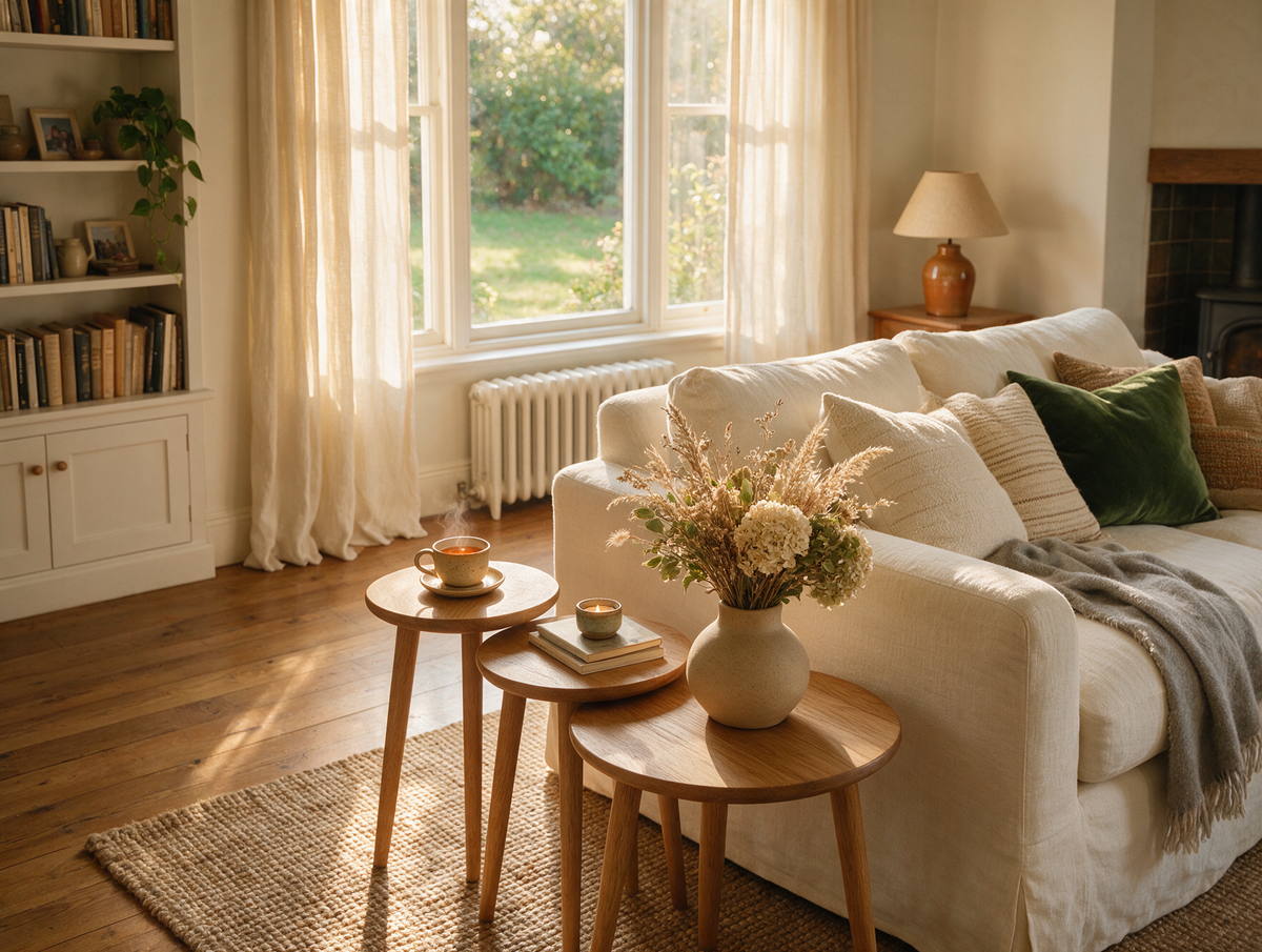
Nest of Tables – What Are They, Who Are They For and How to Style Them
Do you remember Sunday visits to your nan's, when the nest of tables came out from beside the armchair? Three little tables, each tucked neatly under the next, were pulled apart and handed round – one for the teapot, one for the biscuit tin and one for Grandad's crossword – and then slid back together the moment everyone went home.
Read moreabout Nest of Tables – What Are They, Who Are They For and How to Style Them
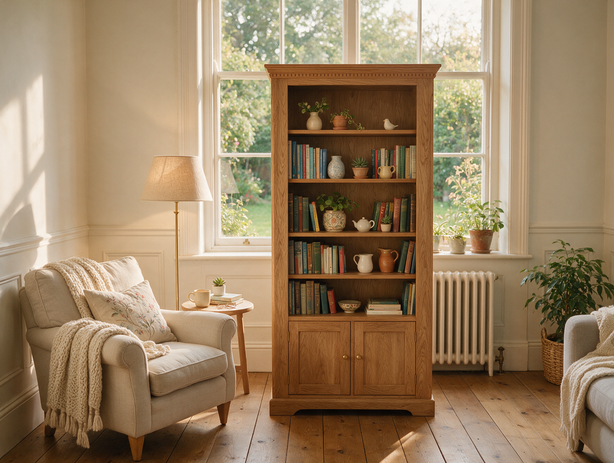
Bookcase Ideas – How to Choose and Style a Bookshelf for Your Living Room
Do you remember the bookcase in your grandparents' front room? Rows of faded paperbacks, a set of encyclopaedias nobody ever finished, holiday souvenirs, a framed school photo and that one heavy atlas you pulled out on rainy afternoons. It was never styled for anyone – and yet it told the whole story of the family.
Read moreabout Bookcase Ideas – How to Choose and Style a Bookshelf for Your Living Room



Share:
What Are Interior Styles? The Most Popular Interiors in 2025
Climbing plants for the home – the trend towards naturalness. Check it out!