


What Color for the Living Room? Wall Colors and Color Concepts for a Harmonious Home
- by Daniel Pawlik
Colors are memories with pigment. The warm beige of Grandma's kitchen wall, the deep sage green of the holiday apartment by the sea, the dark caramel of the library where you sat for hours as a student – every color carries a story, and every wall tells its own story. So, when asking what wall color is right for the living room, it's not just about finding a visual solution. It's about the feeling the room evokes every day when you walk through the door in the morning or return home after a long day.
In this guide, we show you how to find the perfect living room wall color, which shades will dominate in 2026, and how to harmoniously combine colors with your furniture. All without the typical catalog look. With a lot of personality.
Before choosing a specific wall color, it’s worth taking an honest look at the room. Because the perfect living room color does not exist as an absolute measure – it depends on light, furniture, space, and your own lifestyle.
These five factors determine the effect:
Lighting conditions – North-facing rooms tolerate warmer, south-facing rooms cooler tones
Room size – light colors open up, dark colors condense
Furniture colors – the wall is the stage, the furniture are the main characters
Personal style – classic, modern, nostalgic, or minimalist
Desired mood – calm, lively, warm, or cool
When considering what color suits the living room, a proven principle helps: the 60-30-10 rule. 60% main color (the wall), 30% secondary color (sofa, curtains, rug), and 10% accent color (cushions, vases, pictures). This creates a balanced look.
A practical tip from our experience: Never test colors with sample cards. Paint an entire wall area of at least 50 × 50 cm and observe it for 24 hours. Color changes with daylight, artificial light, and the furniture around it. What looks elegant on an A4 card can suddenly appear restless or pale on the wall.
More on choosing suitable furniture for your color scheme can be found in our Sofas – here we show how furniture and color schemes interact.

Small rooms don't need a small color palette. On the contrary: with the right choice, almost any room can be optically enlarged. It's less about "white-on-white" – and more about consciously selecting colors that reflect light.
Colors that make the room appear larger:
Cream white and ivory – the classic choice, warm and inviting
Greige (Grey + Beige) – timeless, with a gentle character
Delicate sage green – fresh, natural, surprisingly airy
Soft powder pink – soft and feminine, yet modern
Light dove blue – cool-elegant, ideal for south-facing rooms
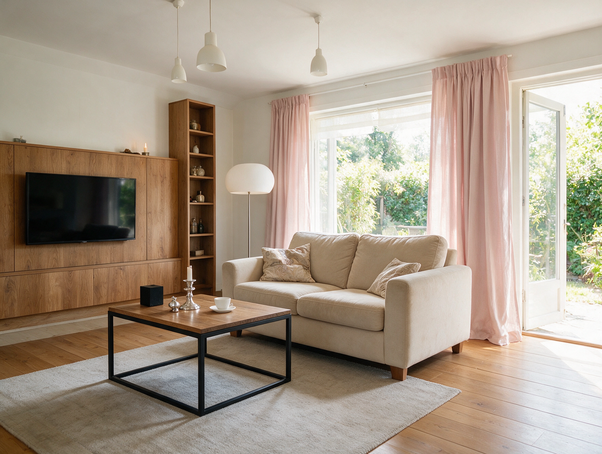
The most important trick for small rooms is tone-on-tone. If walls, curtains, and furniture stay within a similar color family, the boundaries blur – the room appears cohesive and larger. A white sofa in front of a cream-colored wall with a rug in warm sand creates exactly this effect.
Colors also help with ceiling height. A ceiling in the same color as the walls makes the room appear taller. Dark ceilings above light walls, however, can feel oppressive – an effect that older houses with high ceilings consciously utilize, but rarely works in modern new builds.
Another tip: Matte colors absorb light, satin colors reflect it slightly, glossy surfaces often appear restless. For living rooms, we recommend a satin wall paint – it's easy to care for, looks vibrant, and doesn't tire over the years.
This question is one of the most common search terms – and one of the nicest, because it shows: people choose the sofa first, then the wall. This is exactly how it works best, because the sofa is the largest piece of furniture in the room.
Wall color for a grey sofa:
Grey is neutral and tolerates almost any wall color. The most beautiful effects are created with:
Warm earthy tones (terracotta, caramel, rust) for warmth
Sage green and muted olive green for a calm, natural look
Cream white and sand for a timelessly elegant contrast
Deep petrol or anthracite for a dramatic, modern look
Wall color for a beige sofa:
Beige is the supreme discipline of harmonious living. Suitable colors include:
Cream white and off-white – classic, calm, always cohesive
Warm grey or greige – grounds the room
Sage, olive, or muted green – natural, cozy
Deep caramel or rust as an accent wall – adds character
A beautiful example: A sofa from the Sofas category in muted caramel, placed against a cream-white wall and with earthy tones in the rug, almost feels like something out of an old Wes Anderson film – warm, quiet, and personal all at once.
Wall color for a brown sofa:
Brown needs light. The best harmonies are:
Cream white, ivory, or off-white – create contrast
Warm pastels – powder pink, sun yellow, soft ochre
Sage and forest green – create a natural interplay
Sand beige and caramel – tone-on-tone, very elegant
If you own a corner sofa in brown, you should avoid dark wall colors – otherwise, the room can feel heavy. The role of coffee tables is also important: a light wooden table breaks up the space and creates lightness.
Living room color ideas for 2026 have a clear theme: naturalness, warmth, and honesty. After years of grey dominance, many people long for rooms that show personality and evoke memories. This year's trends reflect exactly that.
The most important trend colors for 2026:
Mocha Mousse – warm coffee tone, color of the year 2025, continues to advance
Caramel and warm ochre – colors reminiscent of old bookbindings and vintage leather folders
Sage green and olive green – natural, calming, with an ecological touch
Terracotta and rust – earthy tones that bring warmth and character
Warm beige and sand – timeless base for all other colors
Deep petrol – for those who want a statement tone
What these colors have in common: they tell stories. The caramel tone brings to mind winter evenings in a student flat with an old wool blanket. Sage green brings the holiday apartment in the south into the living room. Terracotta has the charm of the first self-decorated room, where the record player was more important than the wardrobe.
This is precisely what the current trend is about: wall colors for the living room that feel like something, not just look like something. Colors are increasingly chosen for emotion rather than just design statements.
Practical tips for implementation:
An accent wall in a trend color is often enough – the rest of the room remains neutral
Textiles (cushions, blankets, curtains) are the easiest way to test color trends
Before ordering furniture, request fabric samples – only then can you see the true color in daylight
It's better to coordinate colors rather than combine too many – too many trend tones can look restless
If you are unsure about choosing new colors for your living room, start with a color family and combine two to three shades from it. This way, the result remains harmonious without appearing arbitrary.

Which living room color is the most popular?
Neutral tones like beige, greige, and cream white remain classics. In 2026, caramel, sage, and mocha mousse are also highly sought after – warm, earthy colors with character.
Which colors make a living room appear brighter?
Cream white, soft beige, delicate pink, and light green shades reflect light particularly well. Combined with tone-on-tone textiles, the room appears visually more spacious.
What wall color matches a grey sofa?
Earthy tones (terracotta, caramel), sage green, cream white, and deep petrol harmonize particularly well with grey. Choose according to the desired mood.
Should walls and ceiling be painted the same color?
In small rooms, yes – the boundaries blur, making the room appear taller. In old buildings with high ceilings, however, a darker ceiling can deliberately create a cozier atmosphere.
How do you properly test wall paints?
Paint a sample area of at least 50 × 50 cm and observe it for 24 hours under various lighting conditions. This is more reliable than any sample card.
Which living room color ideas suit a nostalgic style?
Warm earthy tones, caramel, dark green, and creamy white are reminiscent of old libraries, farmhouses, and student apartments. They bring history back without looking old-fashioned.
Colors are more than just decoration. They are the framework in which your life unfolds. A warm caramel on the wall, a sage sofa in front of it, a rug in muted sand – and suddenly your living room feels like a place where you can truly arrive. At Pillovely you will find furniture in exactly these earthy color palettes – for everyone who wants more than just a catalog look. Because a home is not a showroom. It is a place where your story continues.
Pillovely, where living begins to feel like home again.
If you enjoyed this text, be sure to check out our other inspirations:
Buying a dining table – what size, shape, and material best suits your dining room?
Loveseat - What Is It, Who Is It For and How to Choose the Right One?
A loveseat is one of those pieces of furniture that can completely change how a room works. It is smaller than a classic sofa, more generous than a single armchair and often easier to place in compact interiors. A loveseat can create a cosy sitting area in a small living room, soften a bedroom corner, complete a reading nook or work as an additional seat next to a larger sofa. Its strength lies in proportion: it gives you the feeling of a sofa without taking over the whole room.
Read moreabout Loveseat - What Is It, Who Is It For and How to Choose the Right One?
EU vs UK Bed Sizes – Will UK Bedding Fit a European Bed?
European beds are 200 cm long, UK beds 191 or 198 cm. A simple EU vs UK bed size table in cm – and what it means for your mattress and fitted sheets.
Read moreabout EU vs UK Bed Sizes – Will UK Bedding Fit a European Bed?
Autumn colors at home – shades that bring peace and warmth
Do you remember autumn from your childhood, when the leaves changed color like a kaleidoscope, and your mom would pull out the pumpkin-colored sweater she'd worn since college? Or those evenings in front of the TV while a storm raged outside, and the lamplight in the house gave everything a warm, amber hue? Those were the days when no one talked about "color palettes" or "color stories"—colors simply existed, as natural as breathing. Today, when we can choose from 50 shades of gray (and no, I'm not talking about THAT book), we sometimes lose track of what truly makes a home feel cozy. At Pillovely, we believe that autumn colors aren't a trend—they're a return to what makes us feel safe. Because "You are someone"—someone who deserves a space filled with colors that snuggle like a grandma's blanket.
Read moreabout Autumn colors at home – shades that bring peace and warmth



Share:
Buying a dining table – what size, shape, and material will best suit your dining room?
Buying a sofa – what really matters? The ultimate guide to buying the perfect sofa