


- by Daniel Pawlik
Colour Drenching Living Room – The Interior Trend Transforming Modern Homes
- by Daniel Pawlik
There's a moment when you walk into a room and your shoulders drop without realising it. The walls, the ceiling, the woodwork, the curtains – everything wrapped in one tone, like the room had been quietly dipped in a single colour. No competing edges, no white ceiling fighting the painted walls, no sharp skirting board interrupting the eye. Just one held note.
That's colour drenching, and it's one of the quietly powerful interior trends of the last few years. After a decade of bright-white walls and grey-everything, a colour drenched living room feels almost radical – more like an old film set or a softly lit hotel suite than a typical contemporary home. It also turns out to be easier to live with, and far more flattering, than its bolder reputation suggests.
Below, we walk through what colour drenching actually is, how to apply it to a living room without overwhelming the space, softer neutral approaches for the colour-cautious, and how the same idea translates to other rooms.
A colour drenching living room takes one colour and runs it across every major surface – walls, ceiling, trim, sometimes the floor and built-in furniture. The result is a space that feels enveloping rather than decorated.
Bold directions worth considering:
Deep green drench. Forest, olive, or sage taken across walls and ceiling. The room reads like a library or a garden room – the colour photographs beautifully under warm lamp light.
Burgundy or oxblood drench. Confident, evening-led, slightly cinematic. Works particularly well in rooms used mostly after dark.
Navy drench. Modern, focused, surprisingly calming. Pairs beautifully with brass and warm wood. We've written more about navy palettes in our navy and yellow living room guide.
Terracotta or rust drench. Warm, Mediterranean, deeply autumnal. Best in rooms with generous natural light.
Plum and aubergine drench. Less common, more personality. Works in compact rooms because the depth gives them weight rather than shrinking them.
Some practical guidance for these bold colour drenching living room ideas:
Use one paint colour across walls and ceiling, or two within the same family (e.g. ceiling slightly lighter).
Match or tonally pair the woodwork. White trim against a deep wall breaks the spell – paint it in the same shade or a closely related one.
Soften with texture, not contrast. Linen curtains in the same family, a bouclé sofa, a wool rug.
Choose lighting carefully. Overhead light flattens a drenched room; warm side-light from lamps brings it alive.
A common myth: drenching makes rooms feel smaller. In practice, the opposite often happens – without sharp colour transitions at the edges, the eye doesn't register where surfaces end, and the room reads as one continuous volume.

Living room colour drenching needs more planning than a standard paint job, but the planning is straightforward once you know the order.
The five-step approach we recommend:
Step 1. Choose your colour by light, not by trend. Hold large paint samples on the wall and watch them across morning, afternoon, and evening light. A colour that sings at 3 p.m. can sulk at 8 p.m.
Step 2. Test on the ceiling too. The ceiling reflects light differently. A shade you love on a wall can read flatter overhead – sometimes that's perfect, sometimes you'll want a half-strength version.
Step 3. Decide on the finish. Matt or eggshell for walls and ceiling; satin or semi-gloss for trim. The slight sheen variation creates depth without breaking the colour.
Step 4. Bring soft furnishings into the family. Sofa, armchair, curtains, rug – aim for tones within the same colour family or in neutral allies.
Step 5. Add one anchor that breaks the rule. A vintage rug, a piece of art, a single ceramic vase in an unexpected colour. The break makes the drenching feel intentional rather than oppressive.
Mini checklist before committing:
Have you painted a test patch at least A3-sized on each wall?
Have you checked the colour against your floor and existing wooden furniture?
Is there enough warm lighting to flatter the colour after dark?
Have you measured how much paint you'll actually need (drenching uses more than a standard repaint – often 30–40% more)?
For furniture choices specifically, drenched rooms reward simplicity. A clean-lined sofa in a neutral or tonal fabric will let the colour do the work. Browse silhouettes that suit this approach in the Pillovely sofa collection.
Not everyone wants to live inside a deep green room, and that's where the colour drenching neutral living room approach earns its keep. The technique is identical – one tone across all surfaces – but the colour stays warm, soft, and easy.
Neutral drenches that consistently work:
Warm cream / oat / oatmeal. The most flattering and forgiving option. Feels like winter morning light.
Mushroom and taupe. Slightly more grown-up. Works beautifully with walnut and brass.
Soft plaster pink / clay. Quietly modern and surprisingly versatile.
Greige (warm grey). The contemporary go-to – easier to live with than cool greys, more refined than pure beige.
Sage or chalky olive. Technically a colour, but soft enough to function as a neutral in most light conditions.
What makes a neutral colour drenched living room special is texture. Without strong colour contrast, the eye starts to register material instead – the matte of plastered walls, the slubby weave of a linen curtain, the soft pile of a wool rug, the dry hand of an oak frame. Build the room around at least four distinct textures and you'll have depth without saturation.
A few styling rules that age well:
Use off-white, bone, or ivory rather than pure white ceramics – they're harsh against drenched neutrals.
Layer wood tones thoughtfully. Choose one dominant and one supporting tone rather than mixing three.
Add one metallic note. Brass, aged gold, or matte black hardware ties the room together without competing.
Keep large-scale art tonal. A painting in the same colour family as the room reads as part of the space.
If you'd like a deeper dive into soft palettes specifically, our blush pink color guide on pillovely.com covers complementary tones that play beautifully with this kind of neutral drenched setting.
So what is colour drenching, fundamentally? It's the practice of using a single colour (or very close tonal family) across every paintable surface in a room – walls, ceiling, trim, doors, sometimes radiators and built-ins. The aim is visual cohesion: a room that reads as one held idea rather than a series of decorated surfaces.
Where it works best, room by room:
Living room. The flagship application – generous walls, lots of soft furnishings, and the chance to layer texture. Covered in detail above.
Bedroom. A colour drench bedroom is one of the most successful applications, especially in cocooning tones – plum, forest green, navy, terracotta. You sleep better in a room that feels held together rather than busy. Keep bed linen tonal and let one piece of bedside furniture provide quiet contrast.
Hallway. Colour drenching hallway spaces is the secret weapon of confident interiors. They're usually narrow, often dark, and frequently afterthoughts. Drenching them in a deep colour (forest, oxblood, charcoal, deep teal) turns them from transition zones into a moment.
Bathroom. Drenched bathrooms feel like high-end hotel suites, particularly in moody tones. Just check that the paint suits high-moisture environments.
Home office. Surprisingly effective. Drenching a workspace in a focused tone – ink blue, deep green, warm grey – reduces visual distraction and helps the room feel like a separate work zone.
Modern colour drenching interiors lean on one principle: commit fully. Half-drenched rooms (walls only, white ceiling) often look like an unfinished thought.

Does colour drenching work in small rooms?
Yes – often better than in large ones. Without sharp colour transitions at the corners, small rooms feel more continuous and less boxy. Choose lighter or warmer tones if you're worried about feeling enclosed.
Do I need to paint the ceiling the same colour?
For full effect, yes. You can drop the intensity by 50% on the ceiling for a slightly lighter overhead, but a stark white ceiling breaks the drench.
Can I colour drench just one wall?
That's not colour drenching – that's an accent wall, a different (and more dated) technique. The whole point of drenching is total commitment to one tone.
What kind of furniture suits a colour drenched living room?
Clean-lined, tonal pieces that don't fight the colour. Curved silhouettes in neutral or matching fabrics work especially well. Avoid heavily patterned upholstery in drenched spaces.
A colour drenched living room asks more of you up front – more decisions, more paint, more conviction about a single shade. In return, it gives you a room that feels properly itself, the kind of space you walk into and immediately settle. If you're planning a drench and looking for furniture that holds up beautifully against rich tones – sofas, armchairs, accent pieces – the Pillovely collection on pillovely.com is a calm starting point, with shapes and fabrics designed to live well inside considered, characterful rooms.
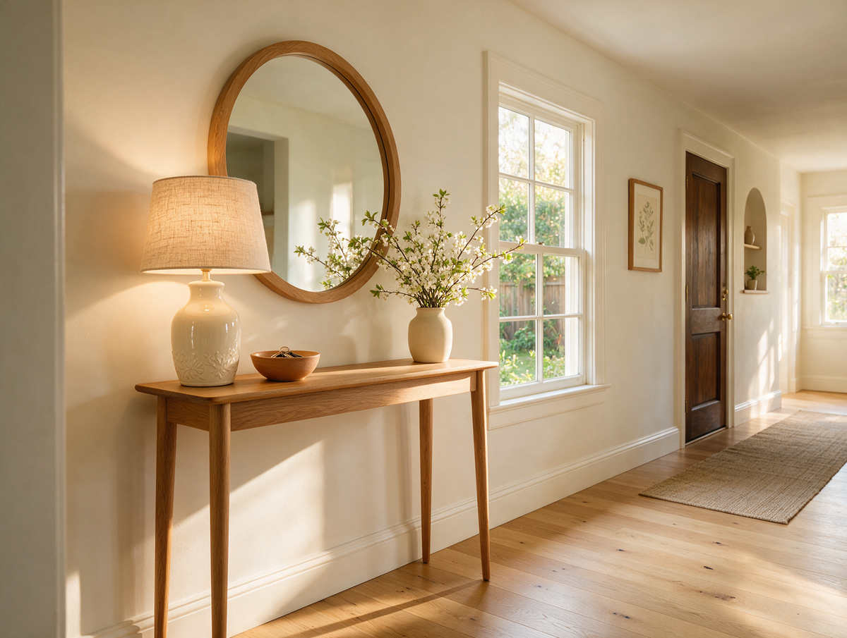
Console Table Ideas – Where to Use One and How to Style It
Do you remember coming home from school and dropping everything on the little table by the front door? Keys in the china dish, letters propped against the lamp, a vase of whatever was flowering in the garden and the old telephone with its curly cord. It was the first thing you saw when you walked in, and somehow it always said: you are home.
Read moreabout Console Table Ideas – Where to Use One and How to Style It
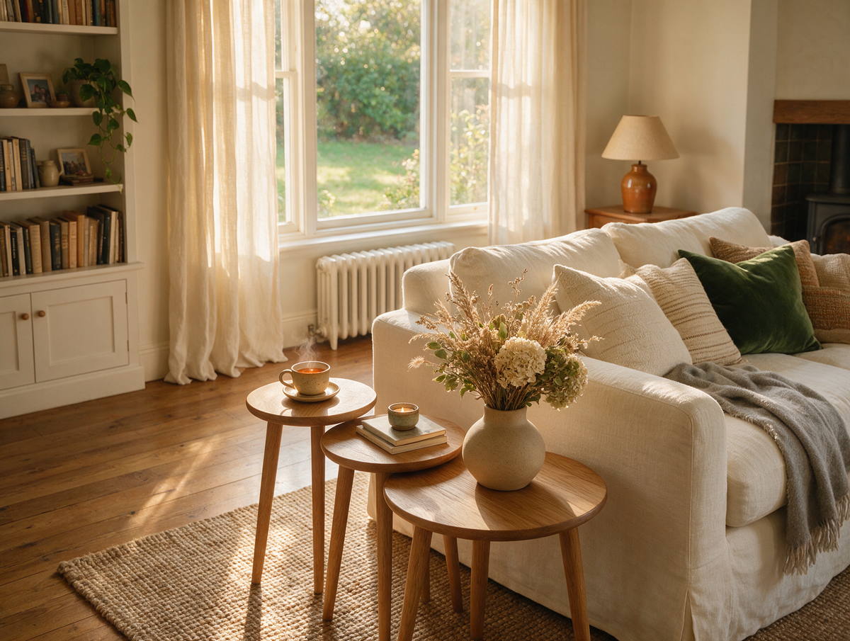
Nest of Tables – What Are They, Who Are They For and How to Style Them
Do you remember Sunday visits to your nan's, when the nest of tables came out from beside the armchair? Three little tables, each tucked neatly under the next, were pulled apart and handed round – one for the teapot, one for the biscuit tin and one for Grandad's crossword – and then slid back together the moment everyone went home.
Read moreabout Nest of Tables – What Are They, Who Are They For and How to Style Them
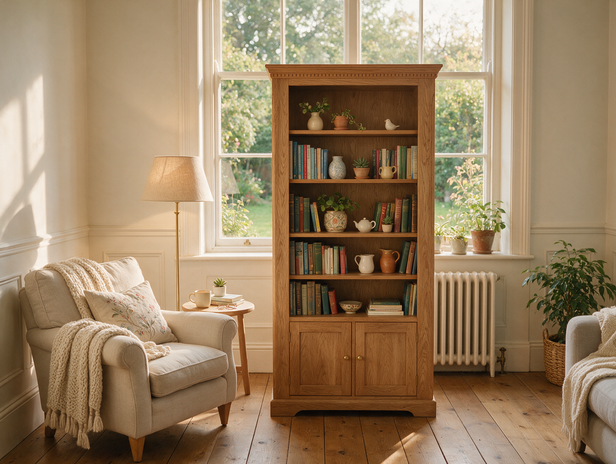
Bookcase Ideas – How to Choose and Style a Bookshelf for Your Living Room
Do you remember the bookcase in your grandparents' front room? Rows of faded paperbacks, a set of encyclopaedias nobody ever finished, holiday souvenirs, a framed school photo and that one heavy atlas you pulled out on rainy afternoons. It was never styled for anyone – and yet it told the whole story of the family.
Read moreabout Bookcase Ideas – How to Choose and Style a Bookshelf for Your Living Room



Share:
Gaming Room Ideas – How to Design a Modern, Comfortable Gaming Setup
Sofa Bed – How to Choose the Best One for Everyday Use and Guest Rooms